About LiaLab

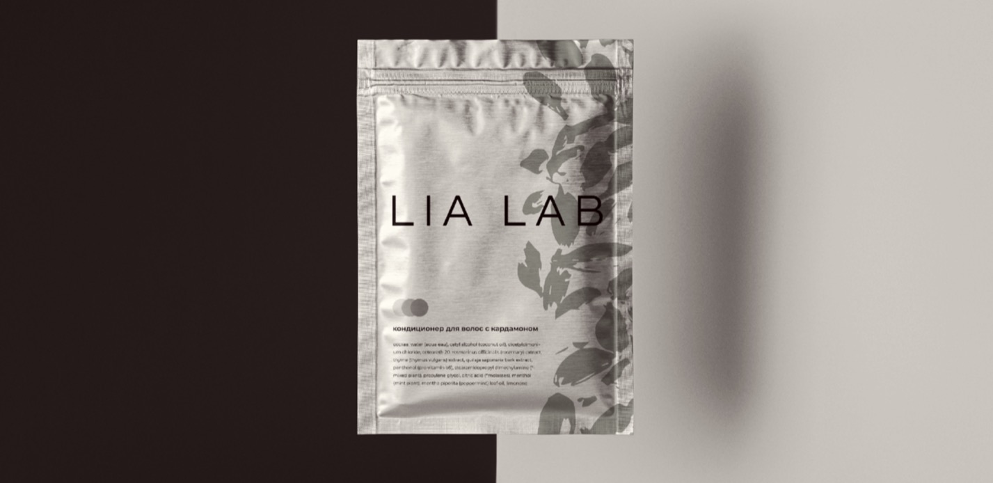
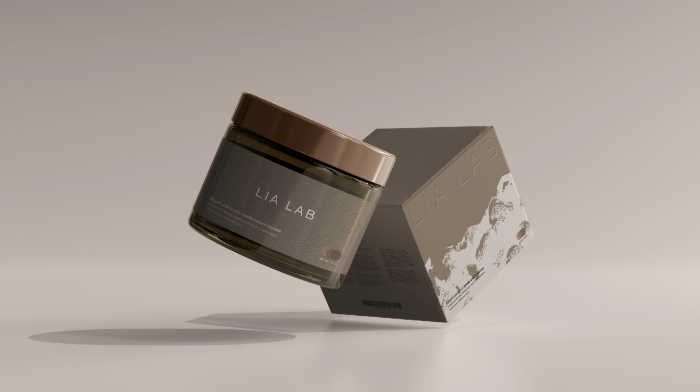
LiaLab is a local skincare brand that supplies the most premium hotels in the Krasnaya Polyana mountain resort. Its wholesale business into luxury hotels ran ahead of its retail: at retail it couldn’t read as a premium brand, and it wanted a stronger idea it could scale. LiaLab had been using ‘express branding’ from a well-known Russian agency — a service you aren’t allowed to edit — and had outgrown it. It is a small producer and not a cosmeceutical, so the goal was to bring together a scientific feel, a luxury level and natural ingredients, and to build the brand and its sales channels first and grow production under it later — the right order. Wave started with a brand platform and a small brand architecture that separated LiaLab from a sub-brand it kept being confused with. The idea: ingredients are gathered at different mountain altitudes, so the identity became a layered silhouette of mountains — each layer its own muted, monochrome color and its own abstract pattern devoted to a specific ingredient, turning a chemical formula into a graphic one, which became the core packaging metaphor. Wave delivered the brand platform, brand architecture, identity and the cosmetics packaging.

LiaLab
Ребрендинг уходовой косметики из Красной Поляны.
Мы соединили фирменные ароматы марки, основанные на натуральных ингредиентах, с главной достопримечательностью места ее производства – знаменитыми горными пейзажами.
Screen Shot 2022-07-08 at 16.15.35.png
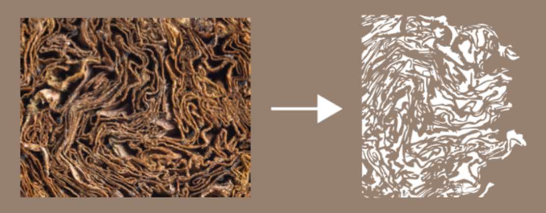
Текстуры органических составляющих мы преобразовали в графические элементы.
Screen Shot 2022-07-08 at 16.20.30.pngScreen Shot 2022-07-08 at 16.19.58.png
Принцип создания текстур универсален для любых растительных и минеральных элементов, что позволяет органично вписывать в стиль новые продукты и линейки.
Фирменные ароматы марки
Screen Shot 2022-07-08 at 16.16.16.png
Ингредиенты, собранные в горах, мы выделили в отдельную категорию – оделали иллюстрации местных пейзажей и показали текстурой места сбора или добычи этих ингредиентов.
Screen Shot 2022-07-08 at 16.16.55.pngScreen Shot 2022-07-08 at 16.18_edited.jpgScreen Shot 2022-07-08 at 16.18.37.pngphoto_2022-07-14 11.46.36.jpegScreen Shot 2022-07-08 at 16.18.02.pngScreen Shot 2022-07-08 at 16.17.43.png
На основе профилей гор и герметичных текстур мы создали лаконичный презентабельный образ бренда, способный развиваться вместе с производством.
Заросли цветущих рододендронов превращаются в минималистичную иллюстрацию для упаковки.
Screen Shot 2022-07-08 at 16.19.36.png888.jpg