
About Signal

Signal is an investment fund that wanted to look more modern and, unusually for its field, recognizable. Investment funds rarely invest in their own identity — clients who need money find them anyway — but Signal decided recognition still mattered. Because the team had a marketing background and answered quickly, Wave didn’t build a full brand platform, only a compact one from their ready answers. The core idea reads ‘signal’ as a cosmic phenomenon: a structure of pulsing stars. The fund is a few people with different expertise working as venture investors, each founder plugging into the projects they back not only with money but with their own knowledge; Wave expressed that union of deep experts as a constellation, where every star emits its own stream yet all lock into one rigid structure moving to a single rhythm. Wave delivered the identity and motion, carrying the pulsation through the typography as well: not only the logo pulses but every headline, via a simple, easily reproducible typographic device the team can apply across any carrier themselves. The client still commissions new items — business cards, presentations — from time to time.

Айдентика инвестиционного фонда Signal
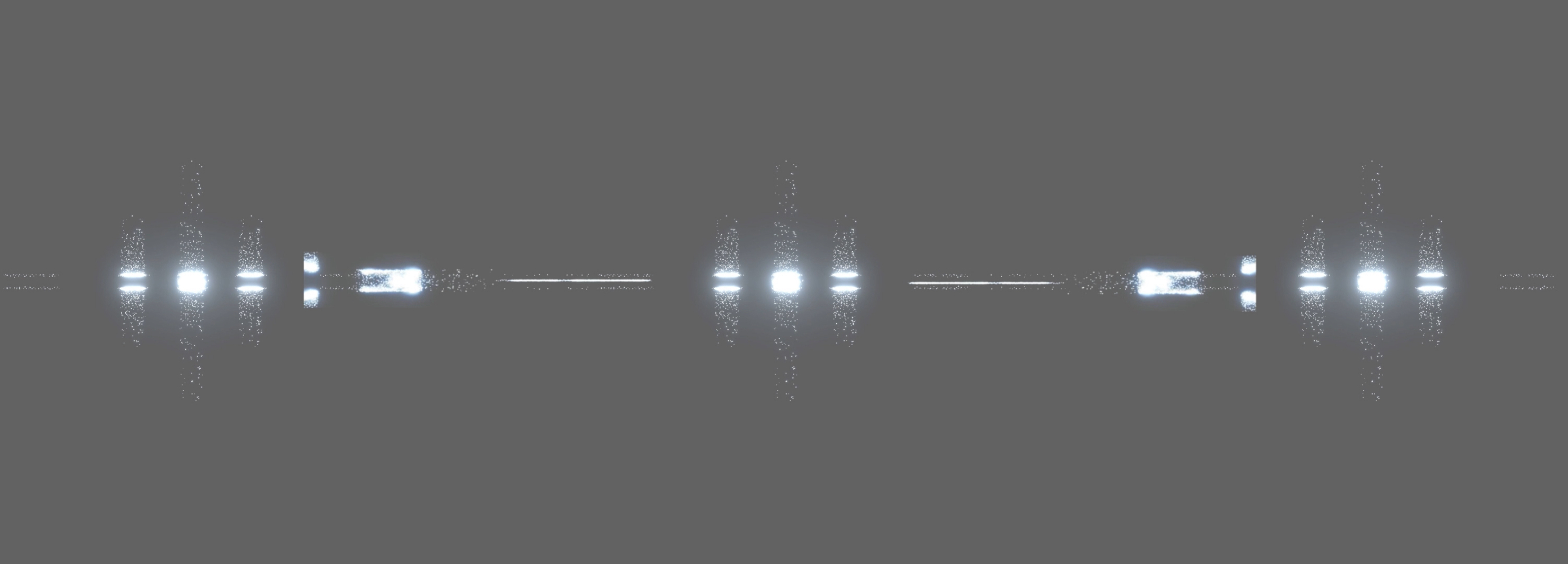
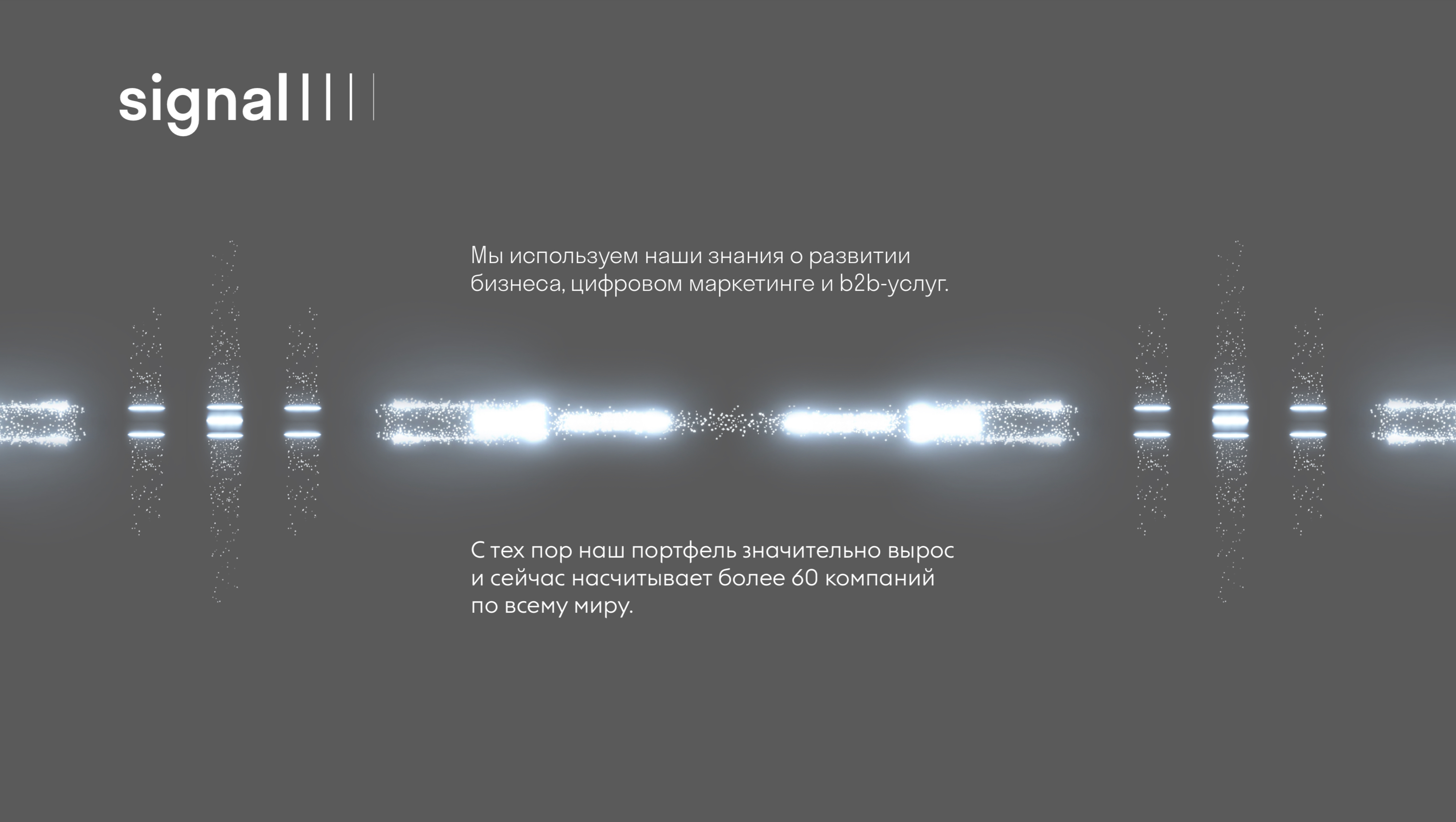
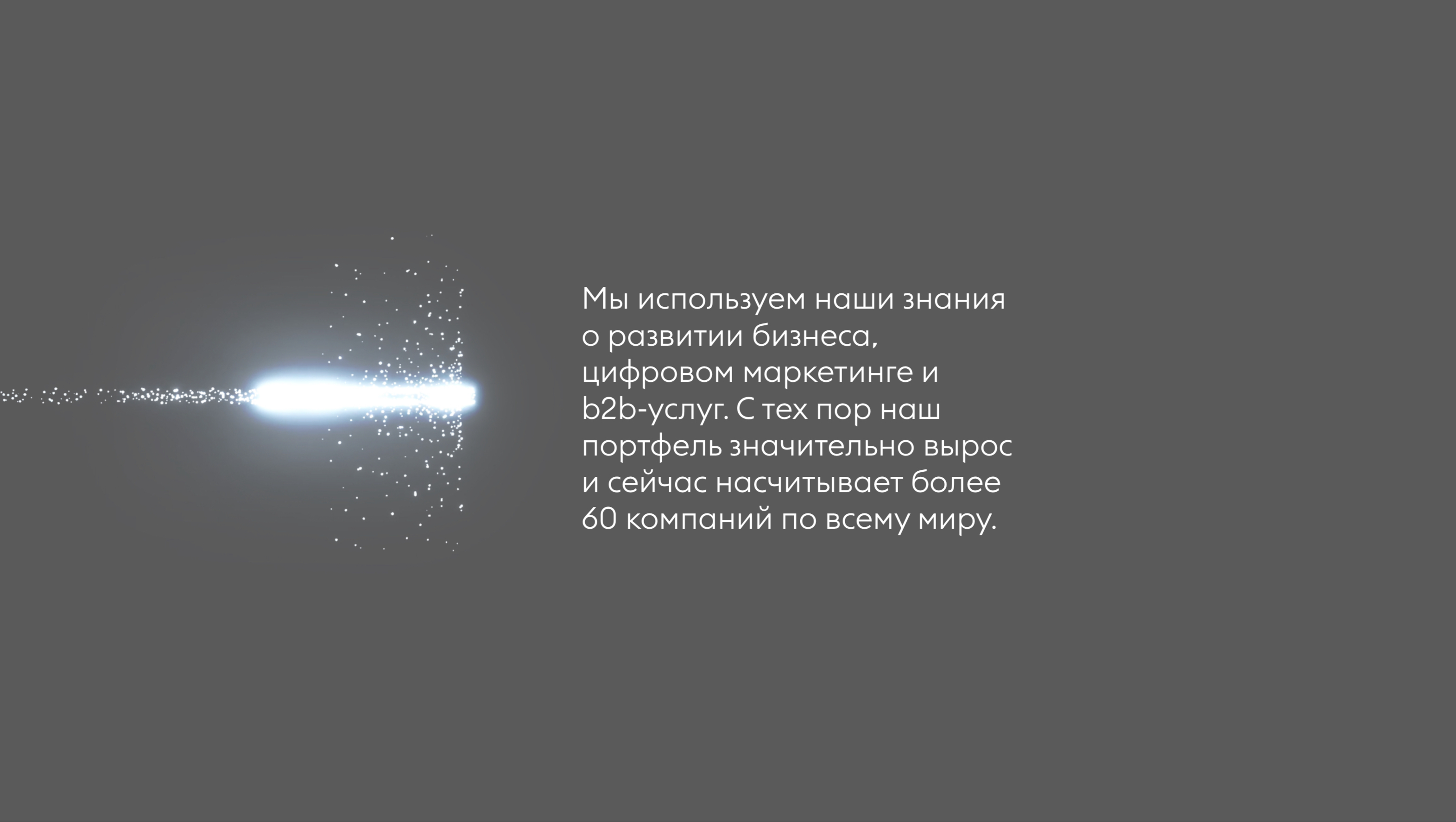
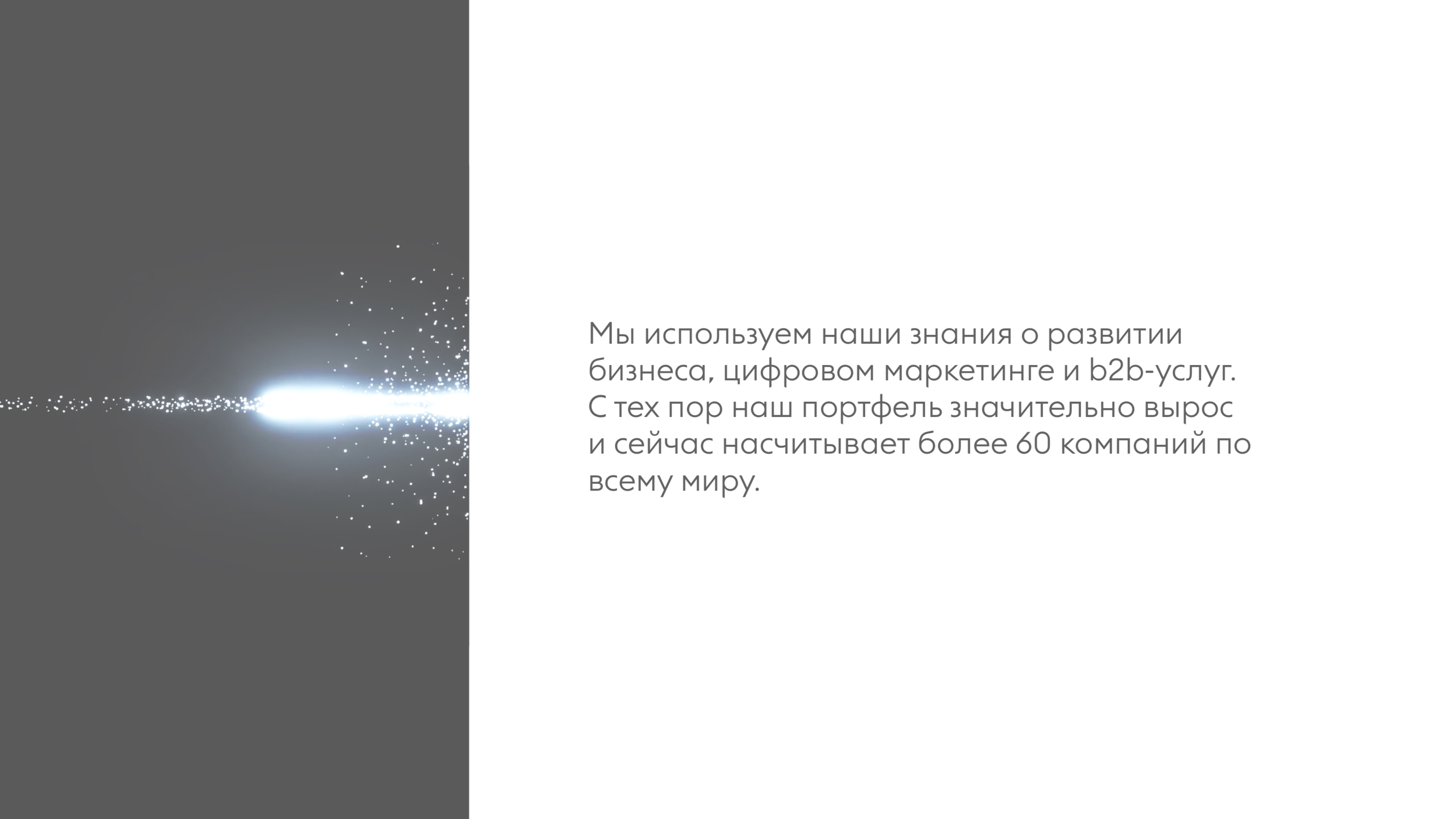
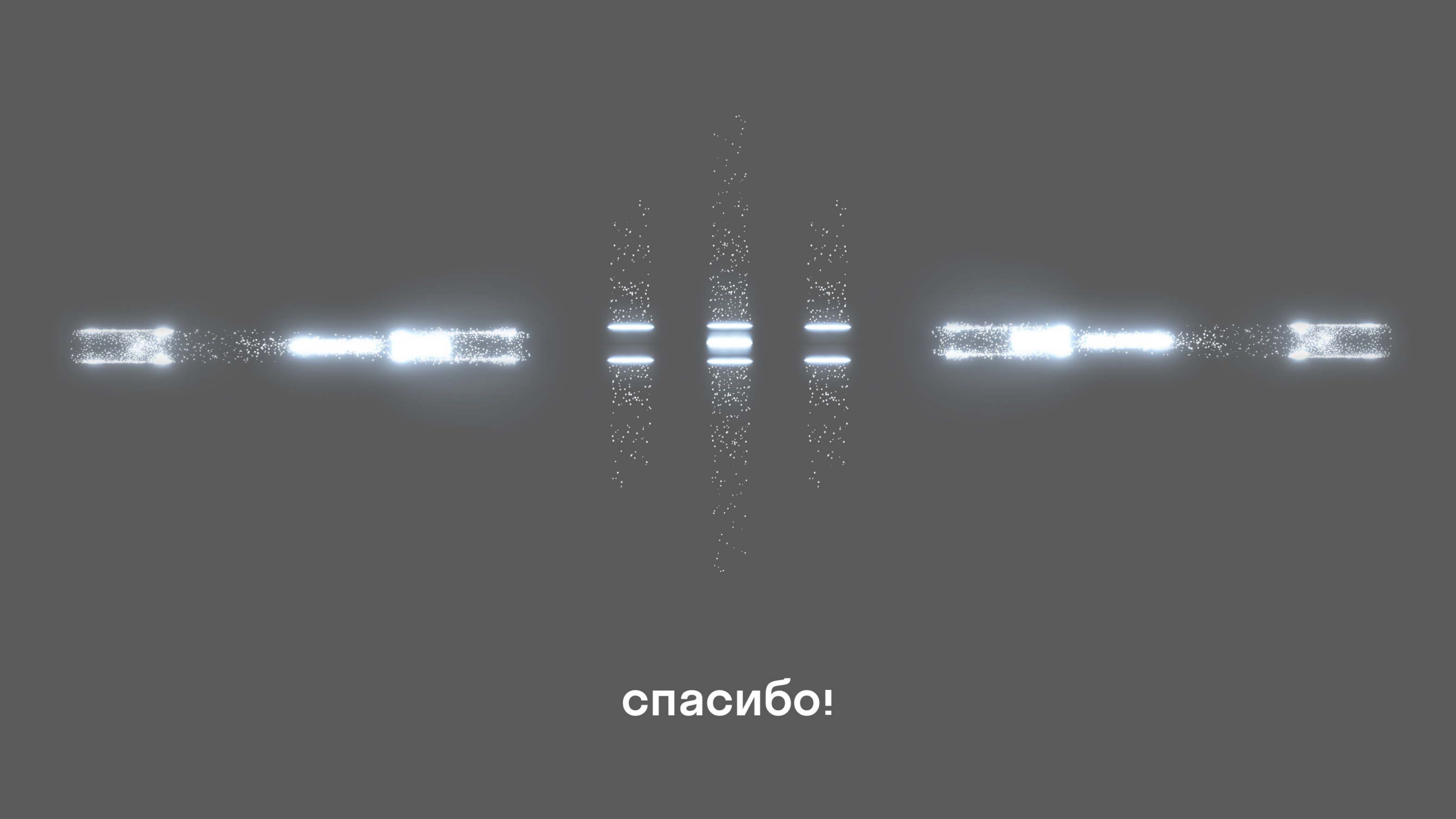
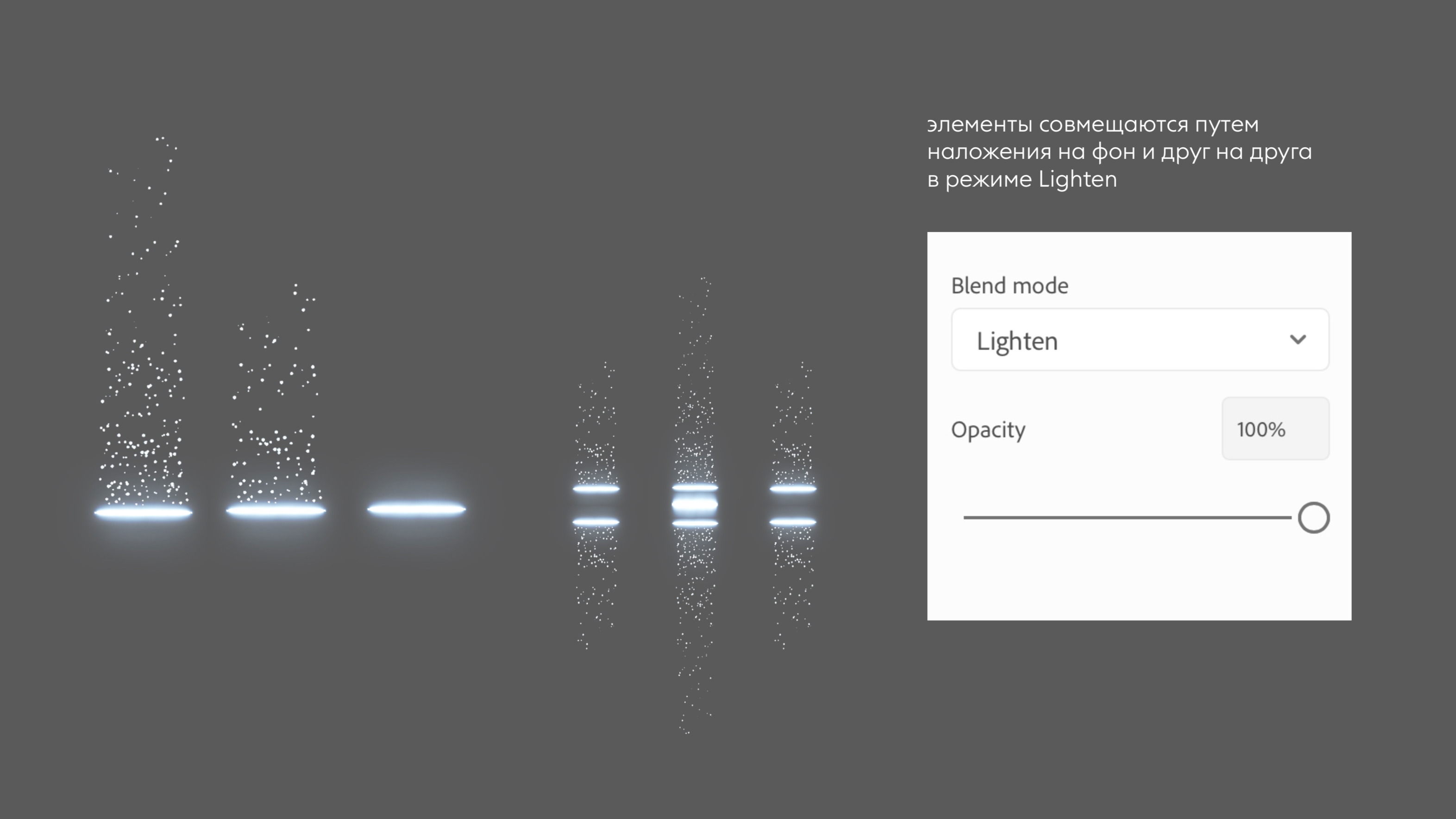
Фонд основан инвесторами с глубокой маркетинговой экспертизой и открытым демократичным подходом к выбору компаний. Сигнал действовать, при этом действовать сообща, основываясь на взаимовыручке, преодолевая вместе трудные времена — стал как коммуникационной так и графической основой стиля. Частицы света, пульсирующие в такт сообщения азбукой морза, задают направление пути потенциальным и текущим клиентам фонда.
Логотип и кейвижуал рассказывают одну историю по-разному.
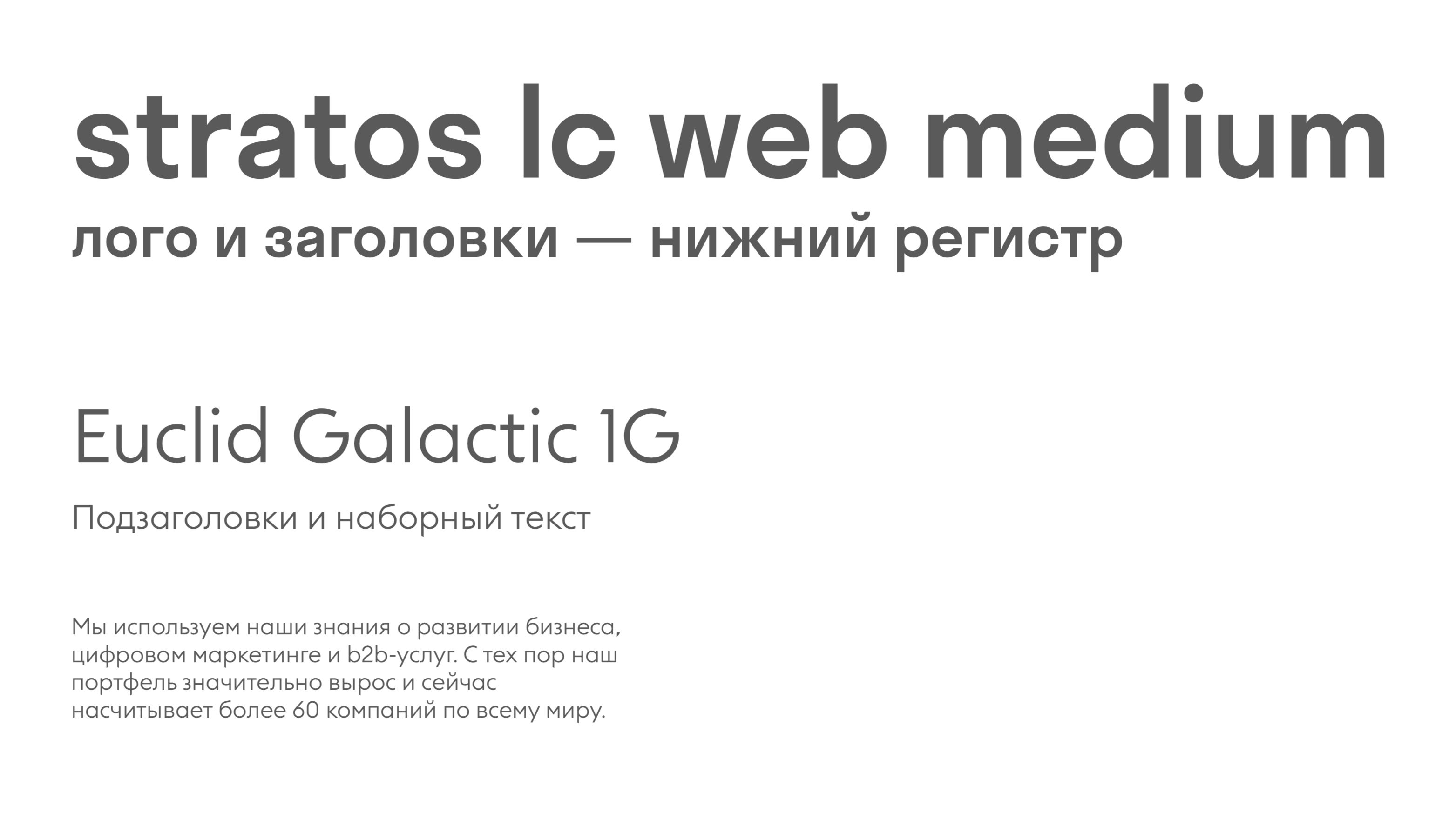
Максимально проста графика шрифтового логотипа, окончание которого можно повторять на заголовках.
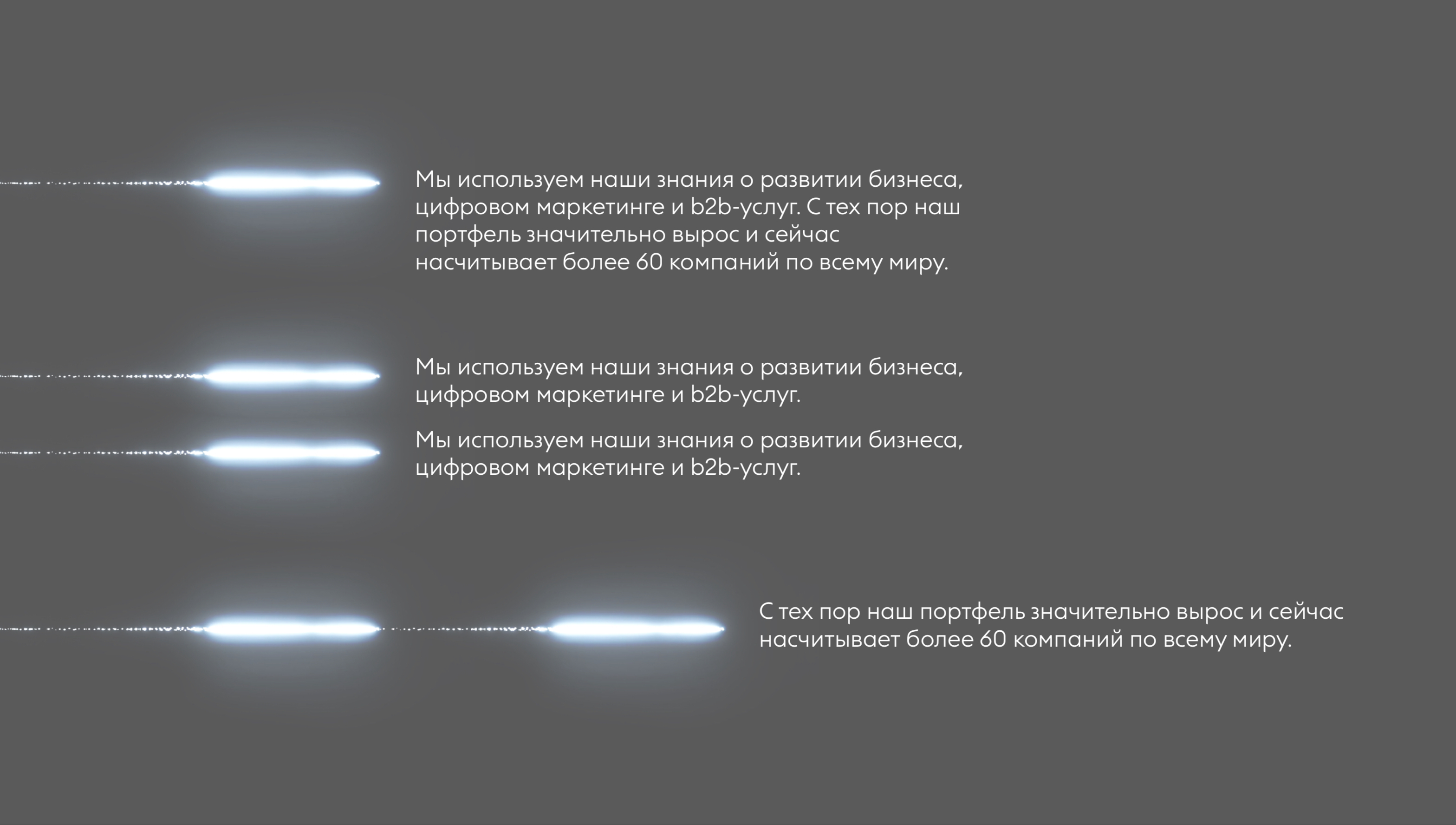
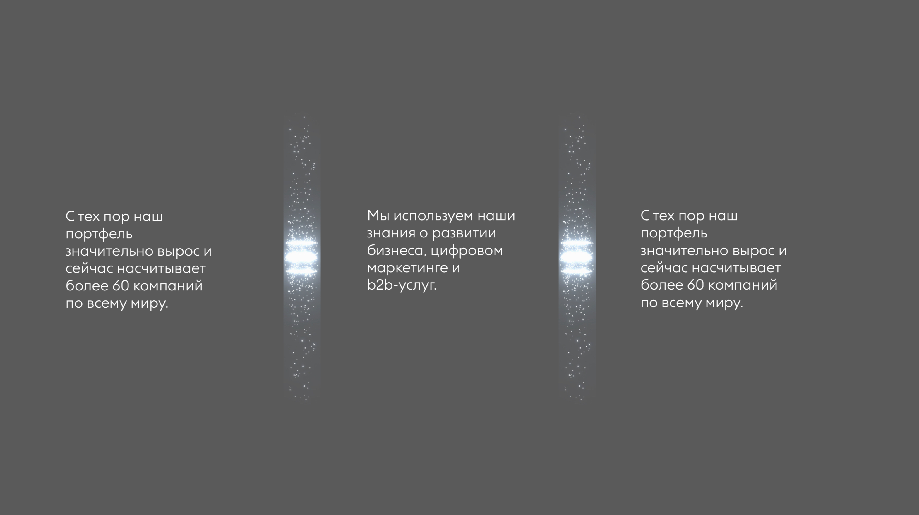
Набор световых сигналов работает как конструктор, из которого можно собрать как большой сложный кейвижуал, так и использовать в качестве буллетов в презентациях.