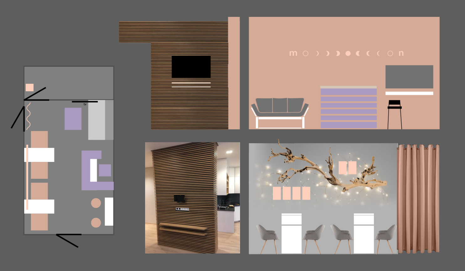
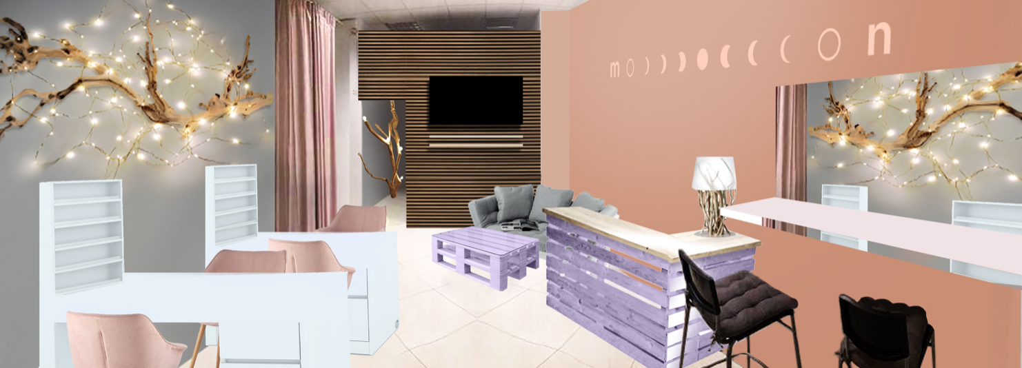
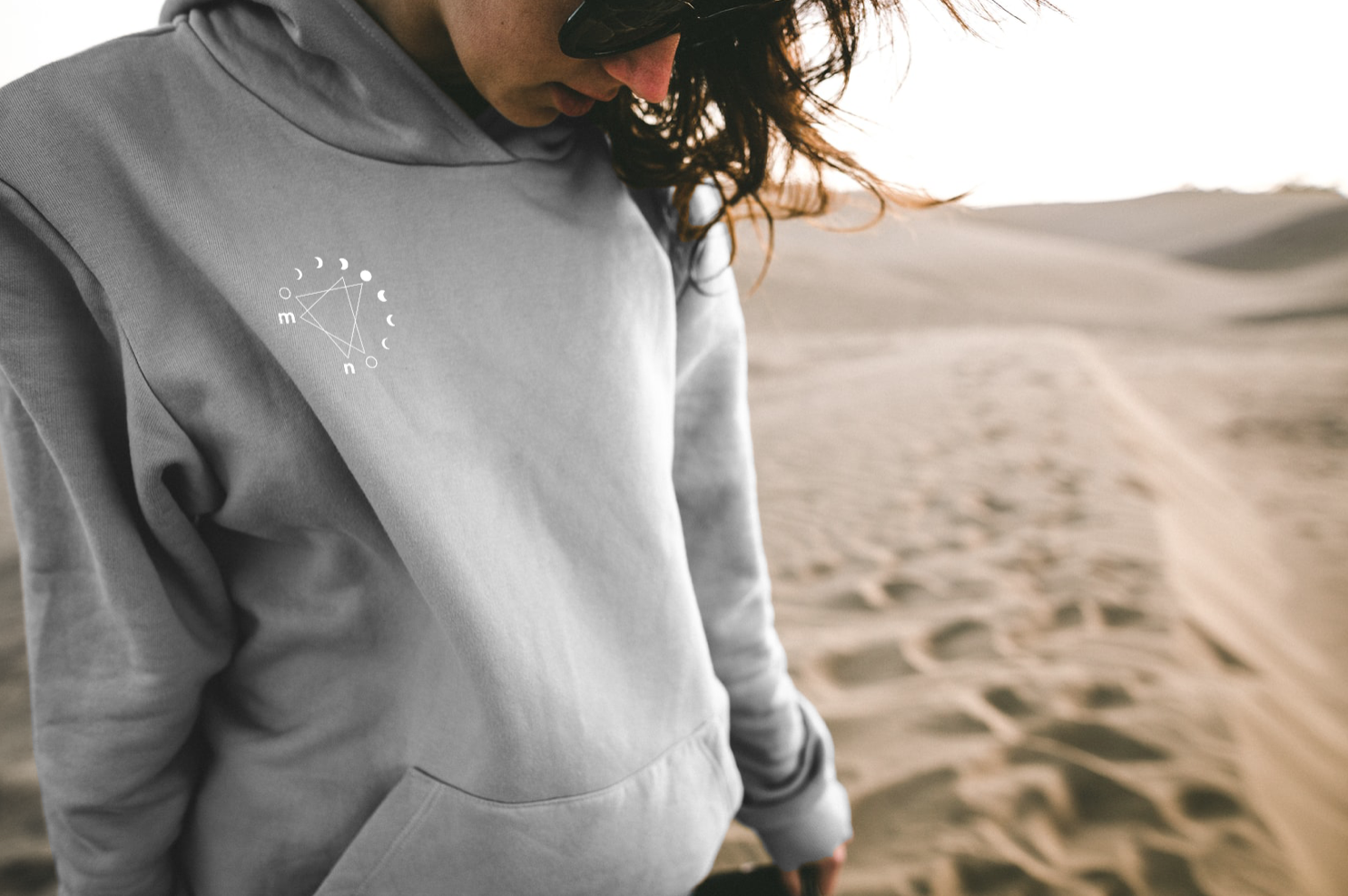
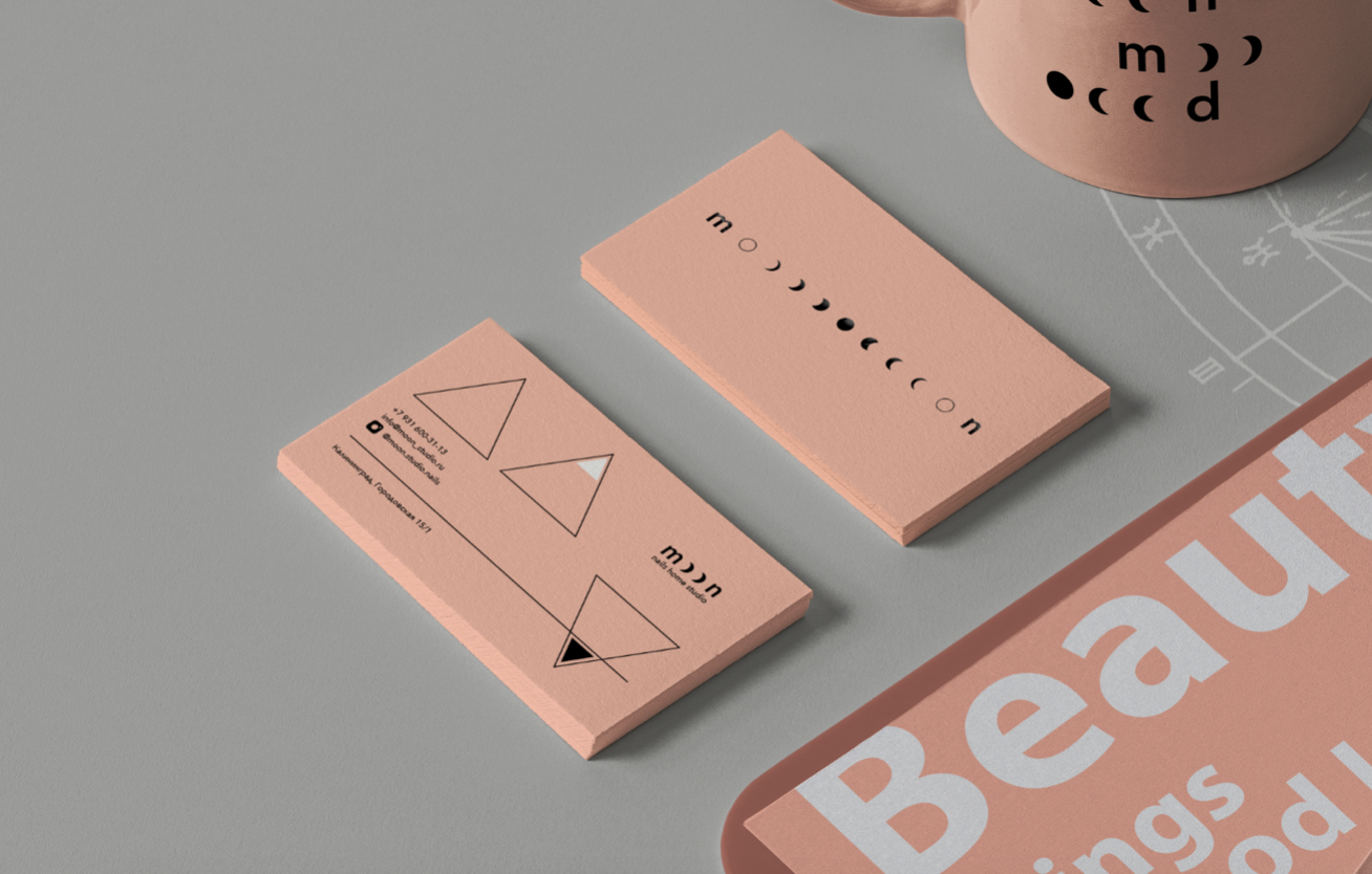
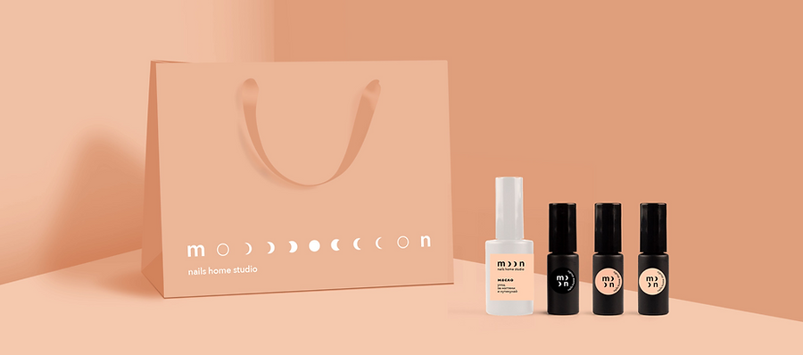
Moon is a nail-service studio in Kaliningrad, on the Baltic coast. Having taken a good office in a visible spot in the city center, the owners wanted to look like a serious organization rather than a home studio, and had no visual style at all — they came from zero. As a small firm they didn’t need a brand platform, so Wave built the identity. The key idea compares nail clippings to crescent moons and weaves them into the typography — two crescents form the ‘M’ — and, since the identity is dynamic, those crescents multiply and scatter across carriers, forming a new composition each time. It reads normally at first glance — the soft powder tones typical of the category, ordinary local models — so it doesn’t scare customers off, but the joke underneath is what catches and makes it memorable, quietly setting the studio apart from the hundreds like it in the city. Wave made merch (T-shirts, aprons), a line of the studio’s own nail products with small labels it can print itself without special production, and a concept for the interior, exterior, façade, signage and window stickers — all of it realized. The brand book was published as a coffee-table catalog that visitors now leaf through in the salon like a piece of art.
A nail studio in Kaliningrad aimed at modern girls and bold guys who value expressing their individuality above public opinion.
Moon
Logo usage options
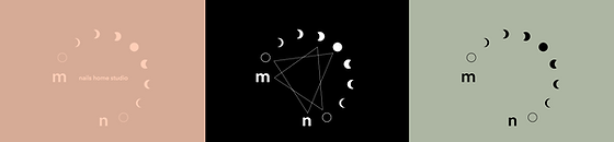
Basic colour combinations Branded palette
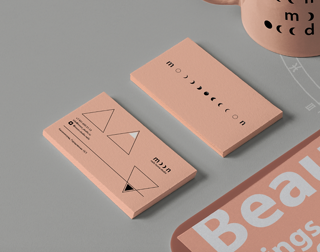
The logo adapts to any format, creating a dynamic typographic system, in which the double letters "o" are played in a corporate way in the form of lunar phases.
Instagram profile is traditionally the main way to attract new customers and communicate with a regular audience for such a business. We have developed a mosaic profile structure with recognizable posts in the feed.
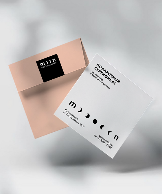
Gift set
A nail studio in Kaliningrad aimed at modern girls and bold guys who value expressing their individuality above public opinion.
Logo usage options
Basic colour combinations
Branded palette
The logo adapts to any format, creating a dynamic typographic system, in which the double letters "o" are played in a corporate way in the form of lunar phases.
Instagram profile is traditionally the main way to attract new customers and communicate with a regular audience for such a business. We have developed a mosaic profile structure with recognizable posts in the feed.