

Identity of the investment fund Signal
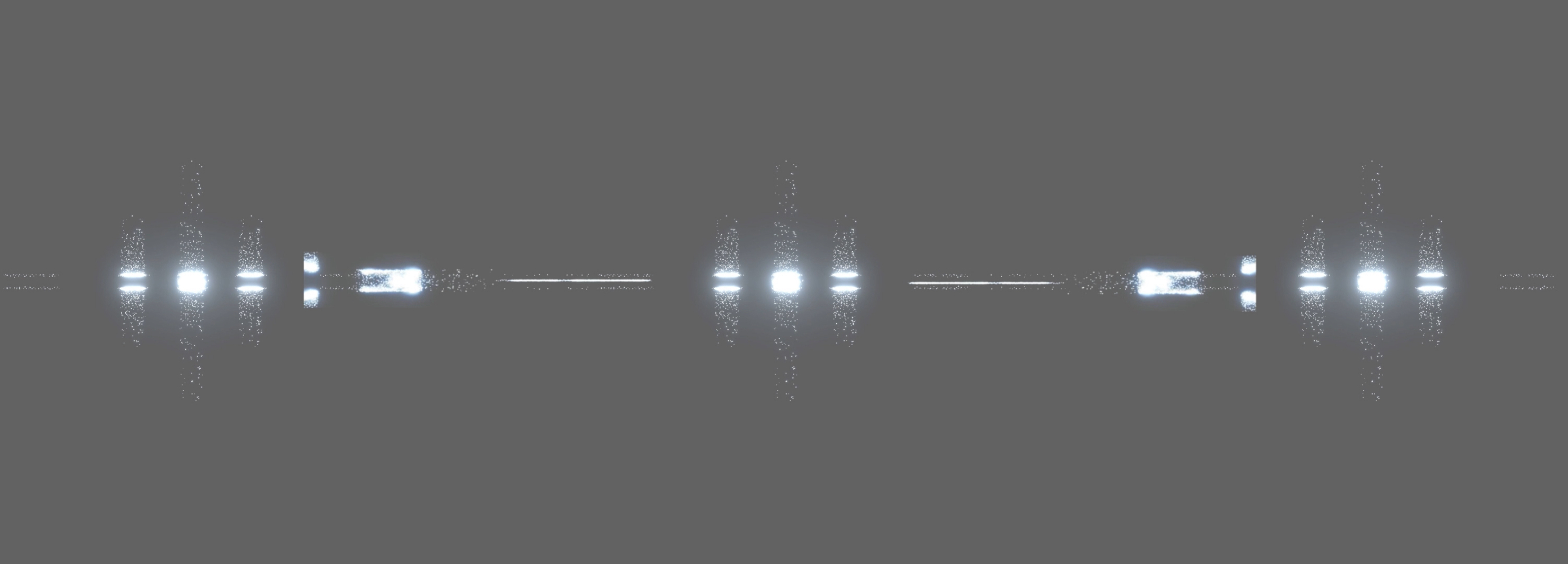
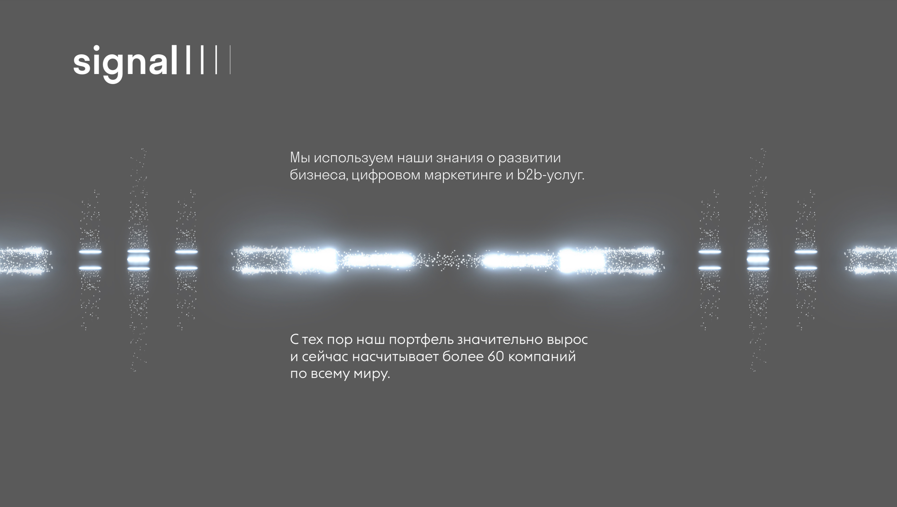
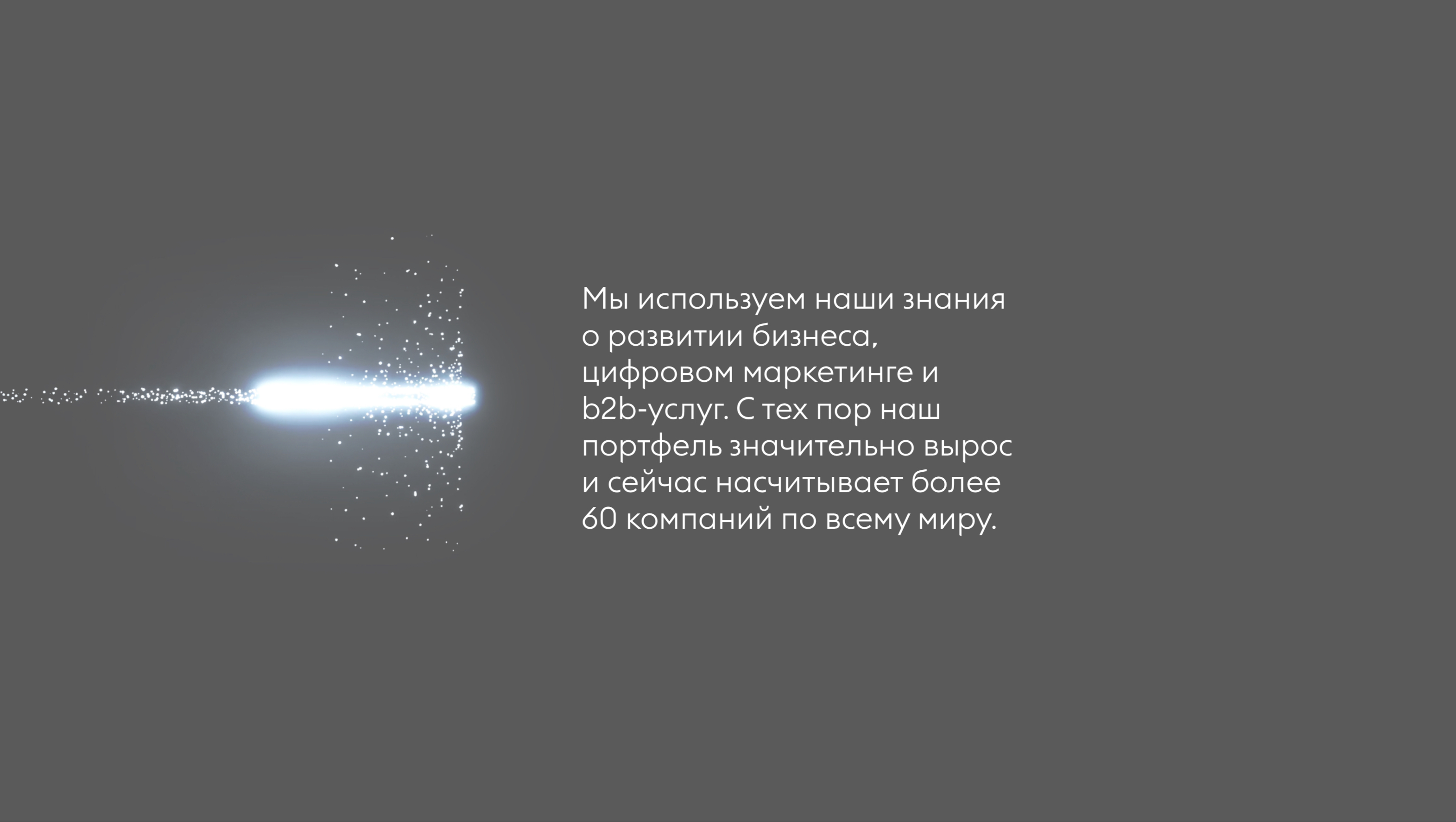
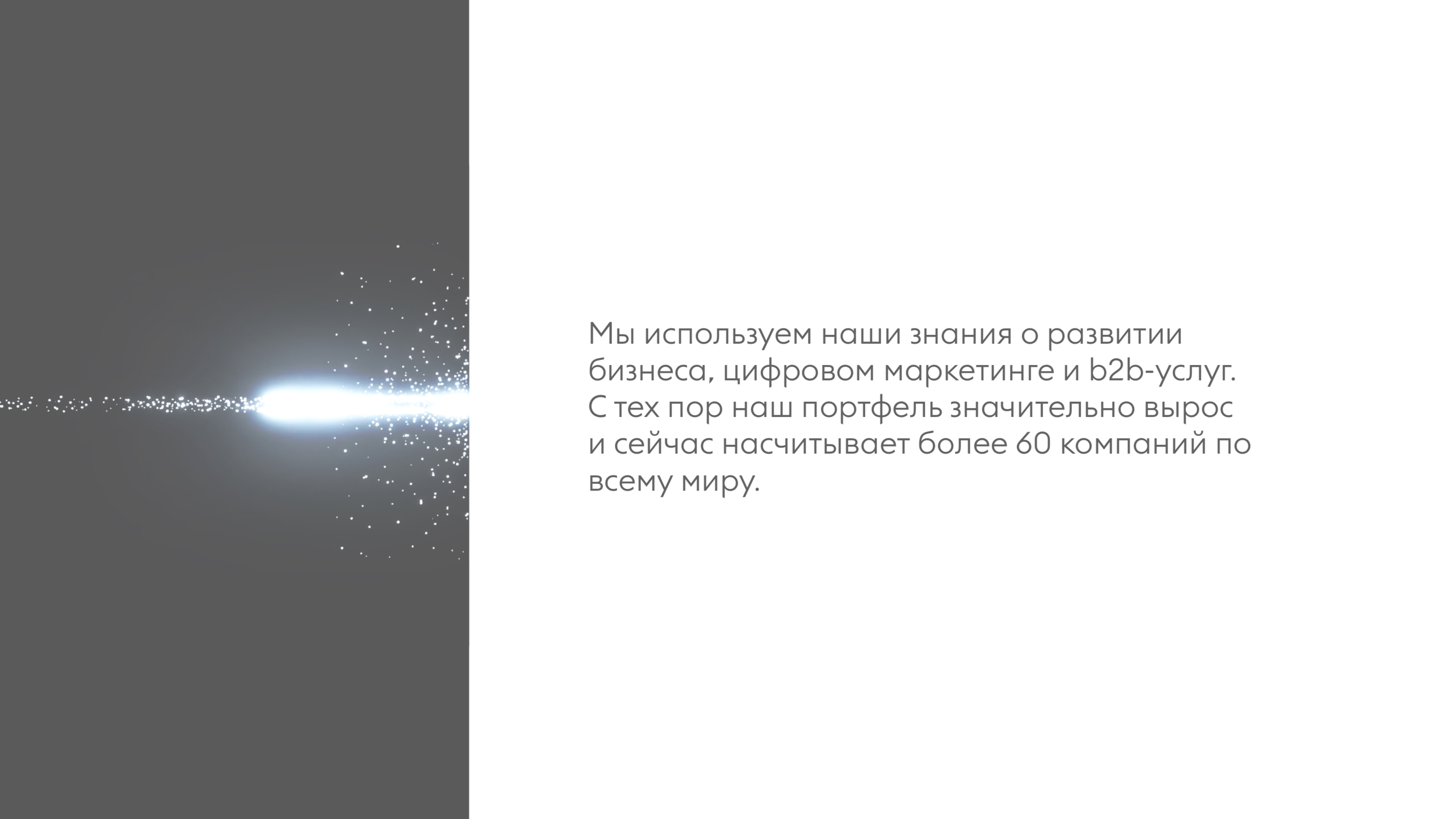
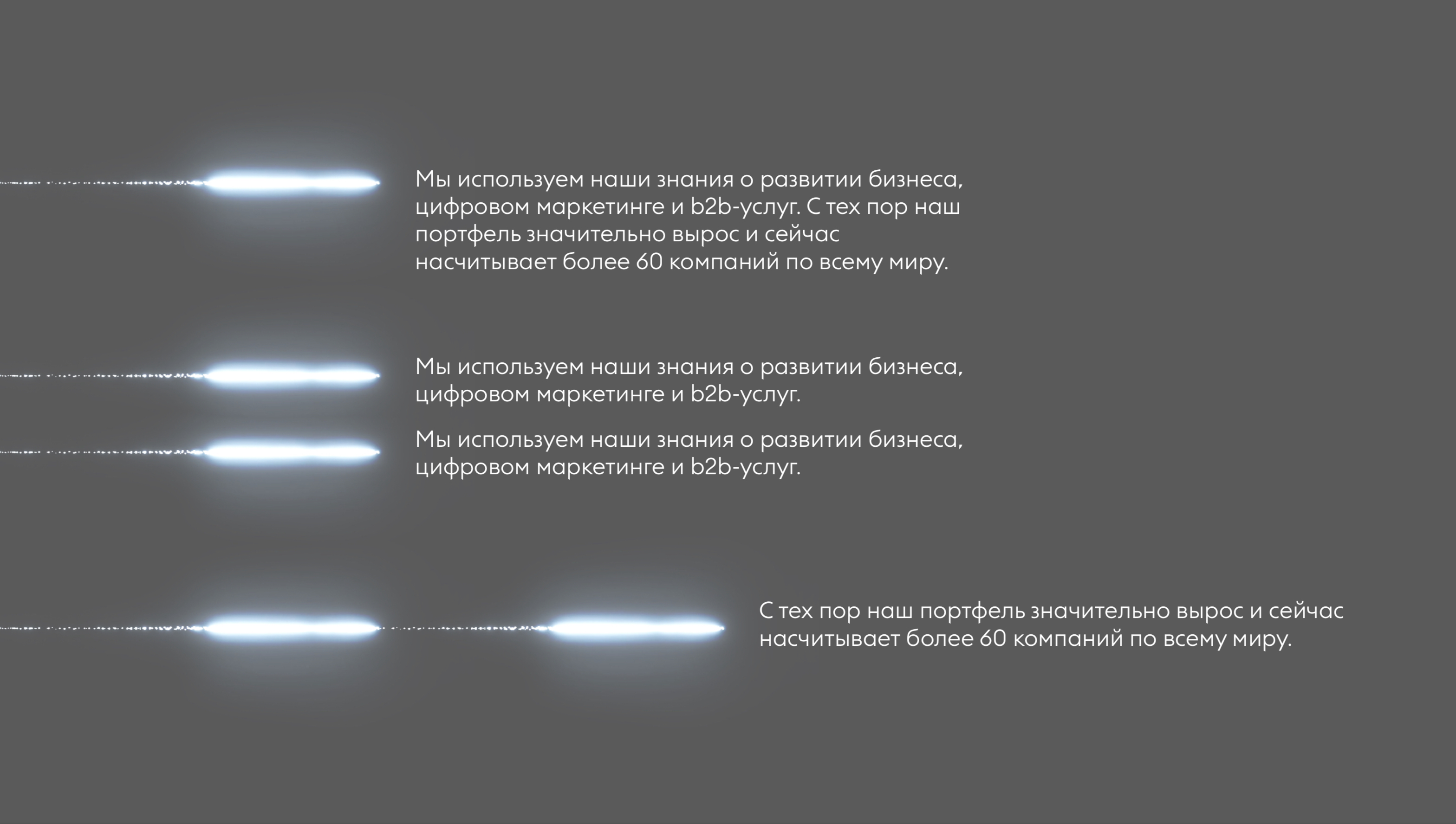
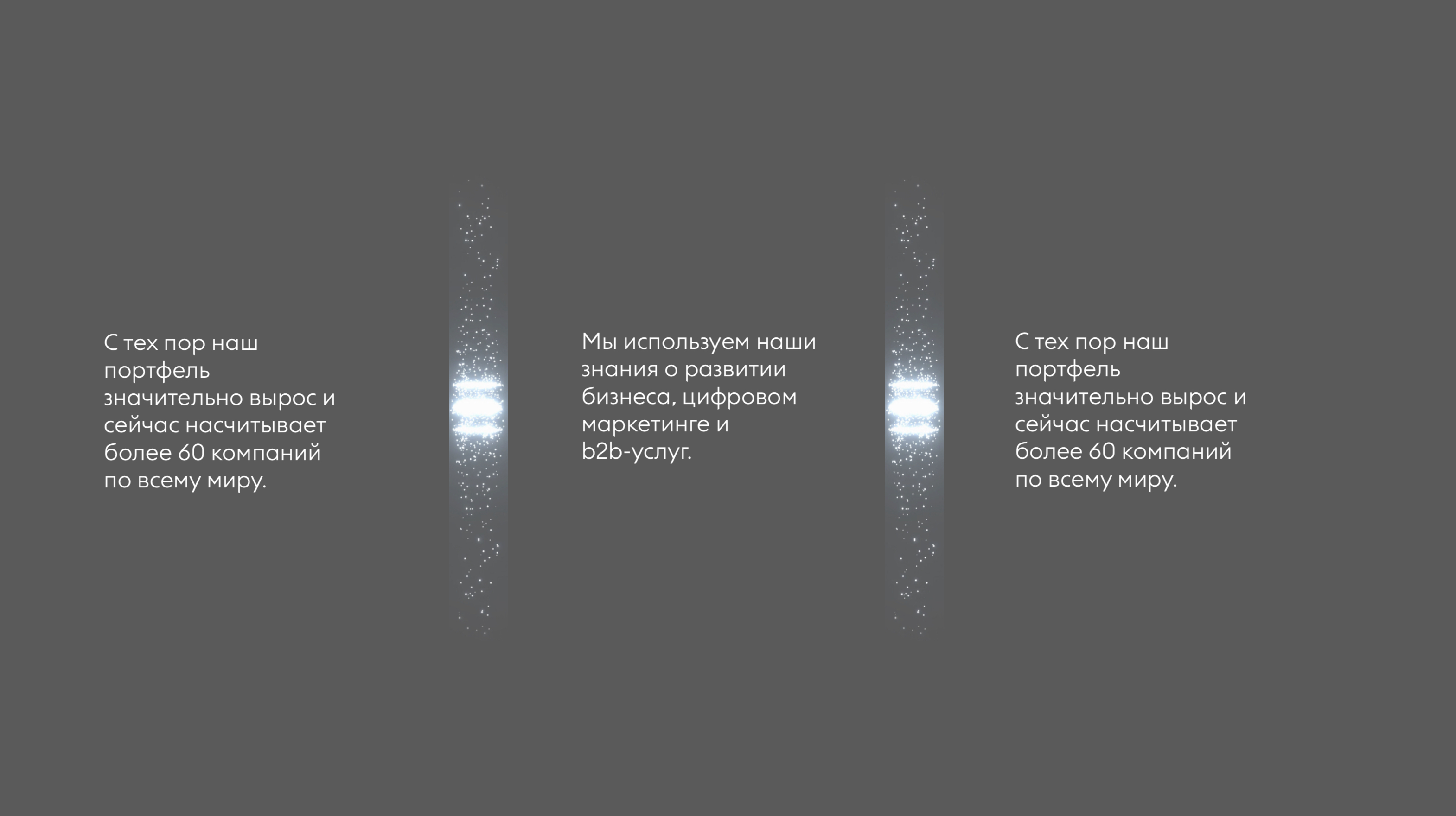
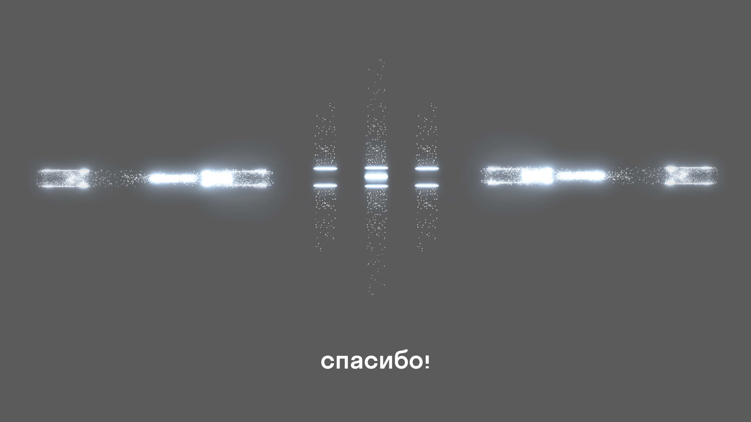
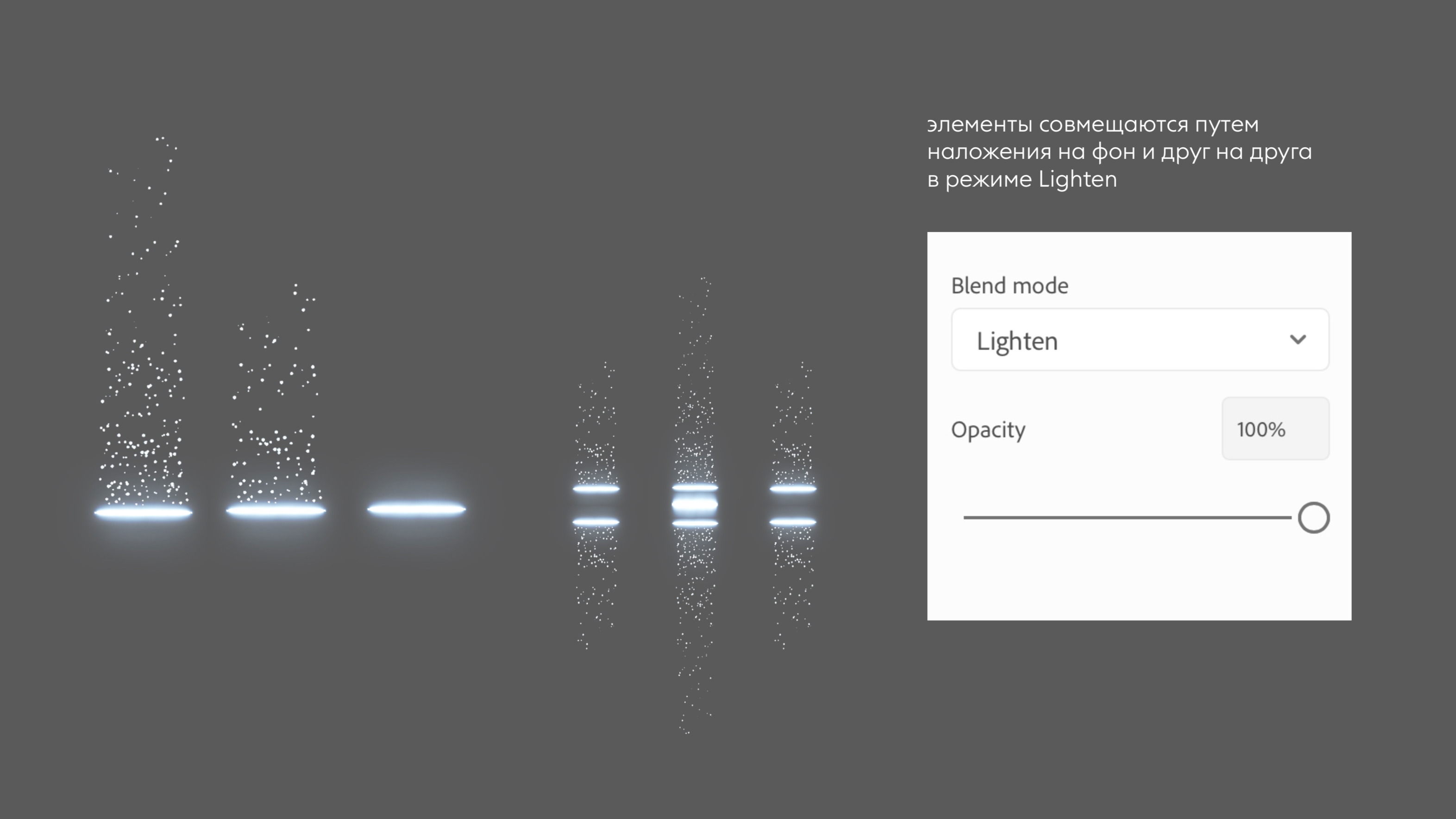
The fund was founded by investors with deep marketing expertise and an open and democratic approach to selecting companies. The signal to act, while acting together, based on mutual support, overcoming difficult times together - has become both the communication and graphic basis of the style. Particles of light, pulsing in rhythm with the morse code message, set the direction of the path for potential and current clients of the Foundation.


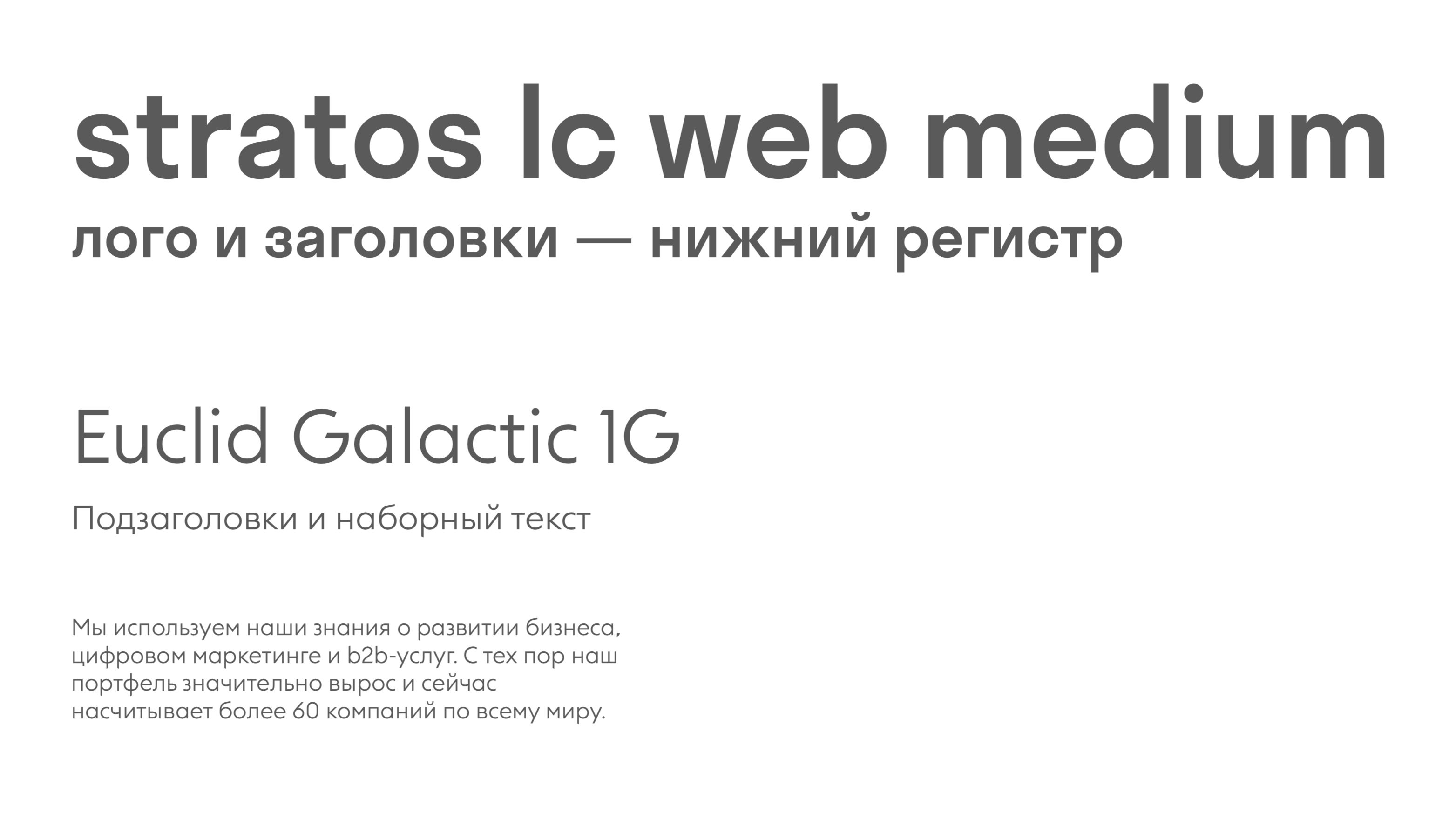
The logo and the keyword tell the same story in different ways.
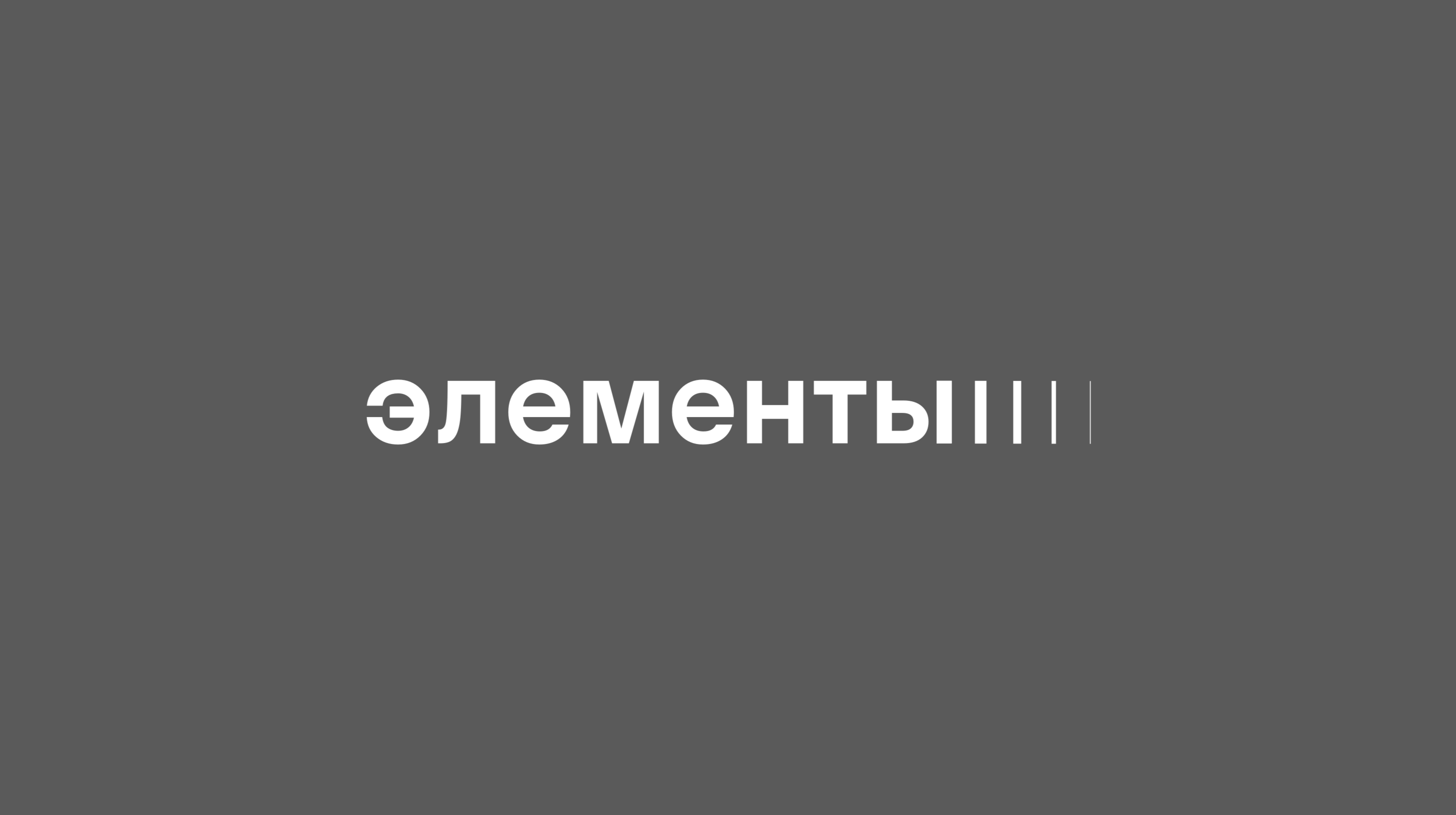
The graphics of the typographic logo are as simple as possible, the ending of which can be repeated on the headlines.
The set of light signals works like a constructor, from which you can build both a large complex keywigual and use as bullets in presentations.


