





DRIVEN CENTER
Identity for a corporate event center located on the island of Bali. The center offers off-site retreats, strategy sessions, kick-offs and other programs for team building or employee reboot. The center also includes co-living for long-term stays for individuals who are ready to test a new way of life in the community.
Logotype / Variation
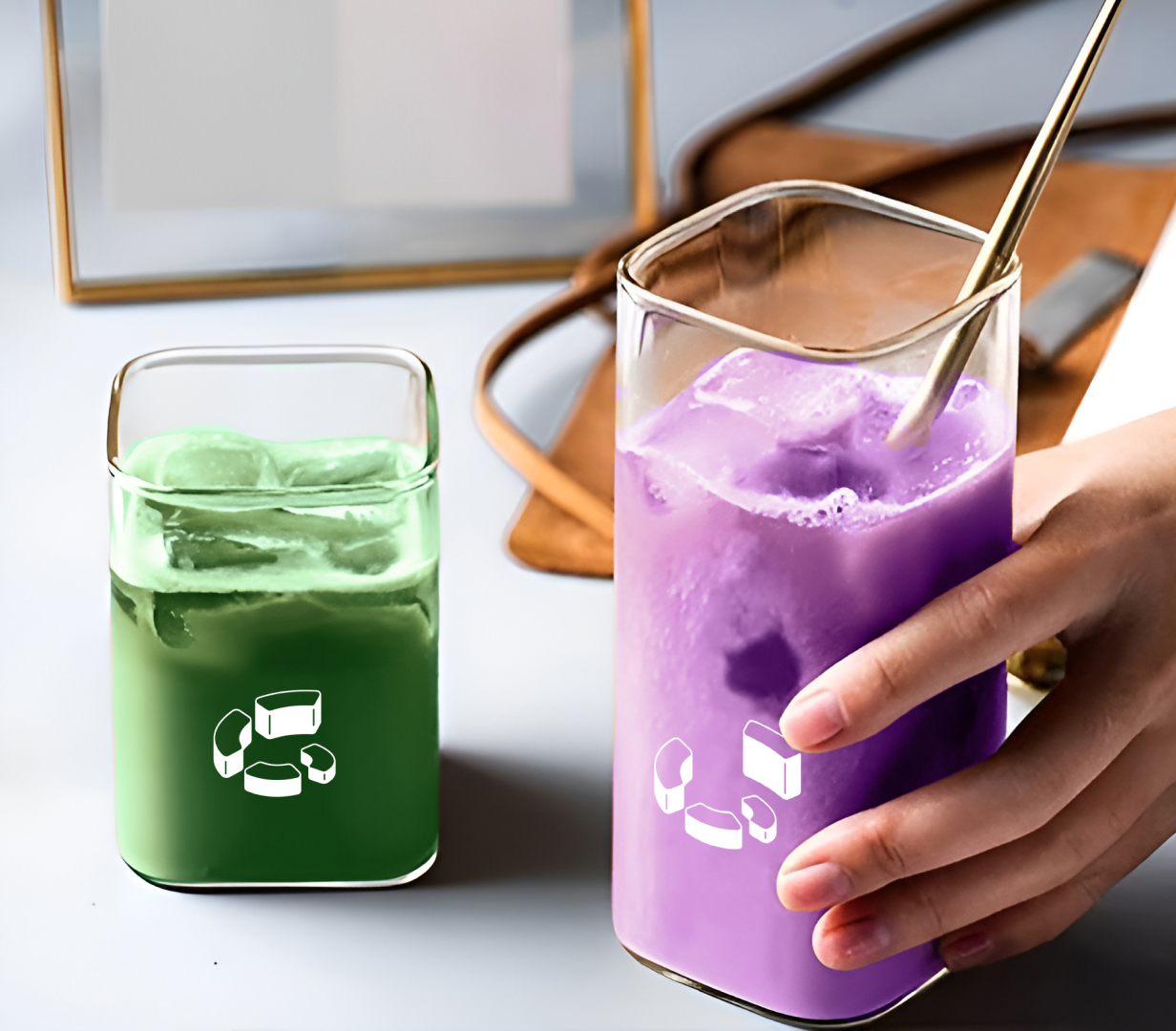
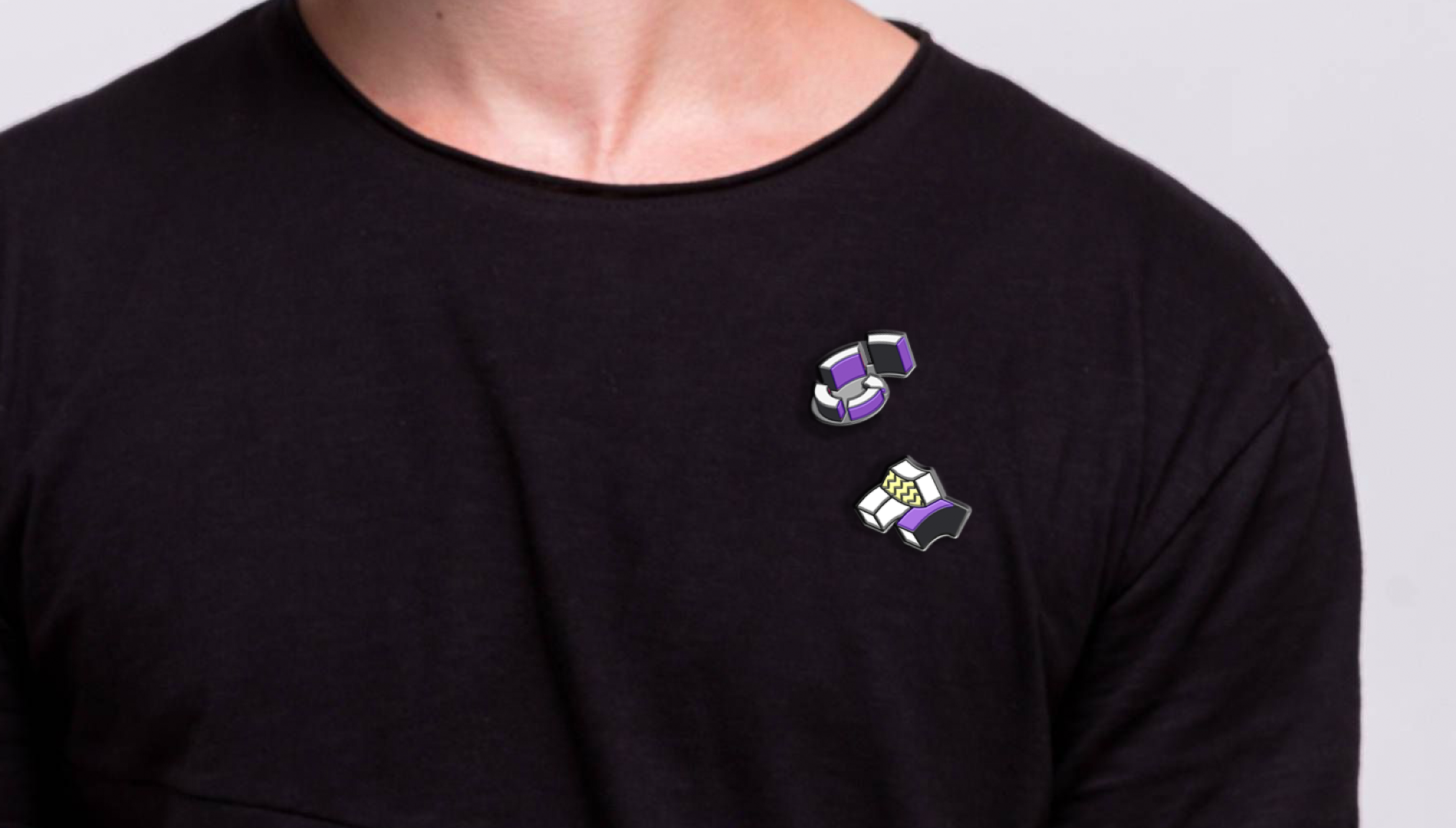
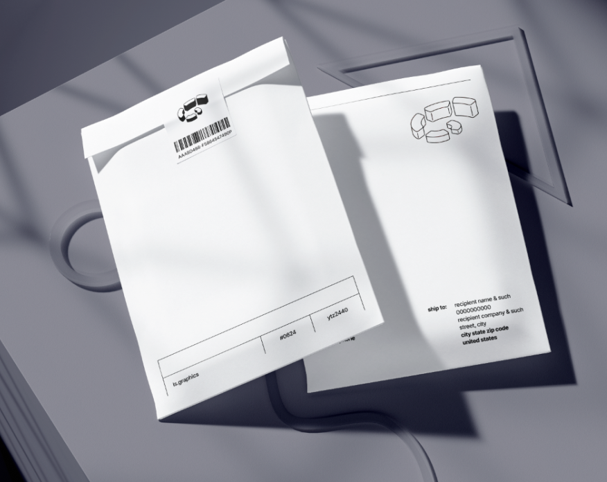
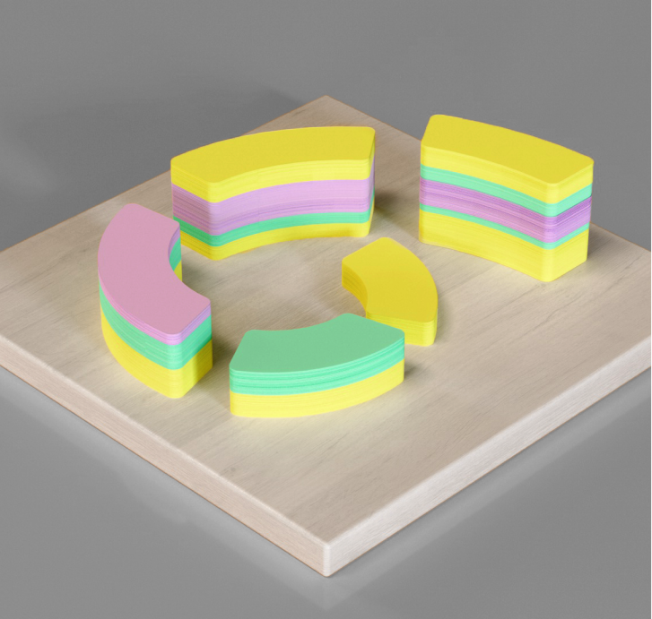
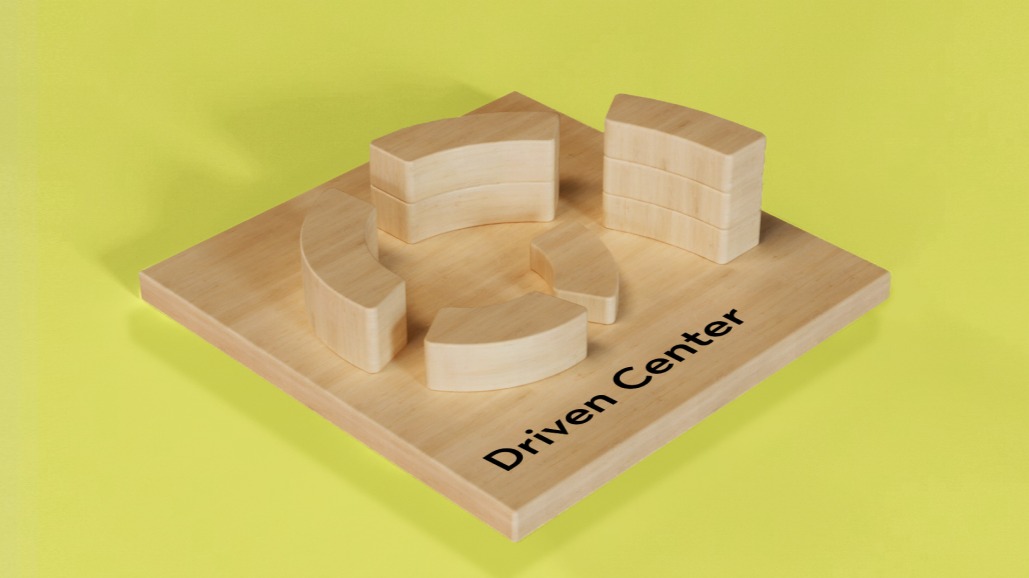
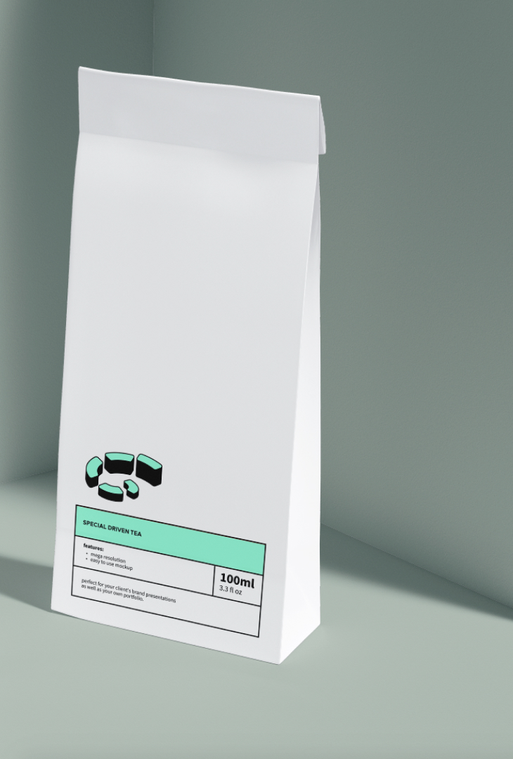
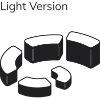
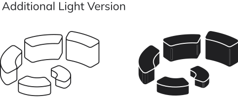
The logo refers to the architectural complex of the center, consisting of buildings arranged in a spiral. An axonometric logo is disassembled like a construction set into its component parts, and from which new identity elements are created.

IlIustrations
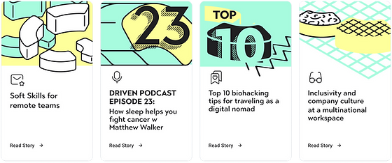
Illustrations are assembled from logo elements as from a constructor. The illustrations are axonometric constructions in corporate colors with the possible use of corporate patterns.


Rule:
In one illustration, as well as on one page of the site / presentation, no more than two of the three corporate colors are used - green, lavender and yellow


The illustrations are collected from the same design elements, but are made in different graphic styles - depending on the level of formality of the communication message.


Typography
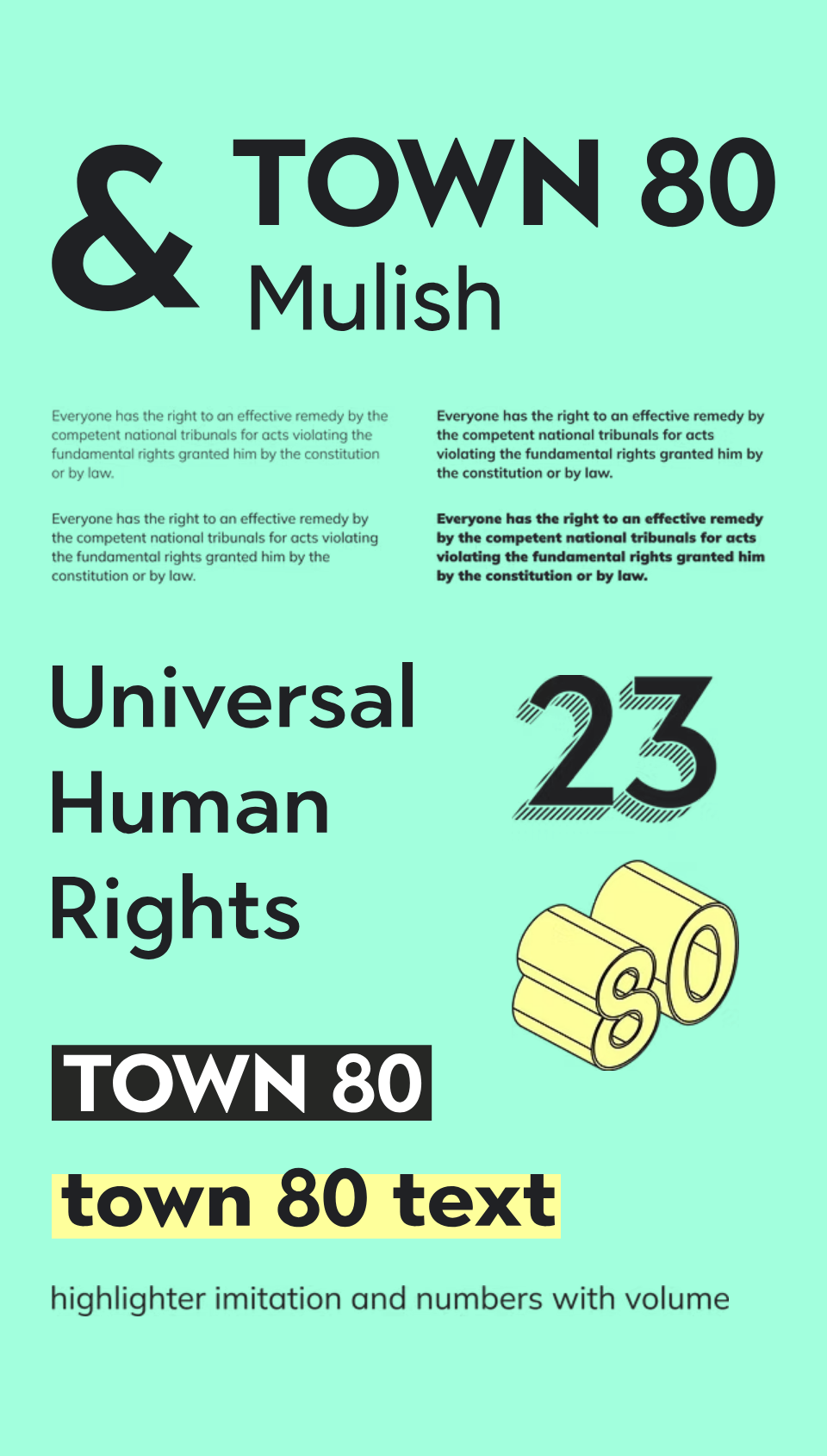
The font pair is represented by
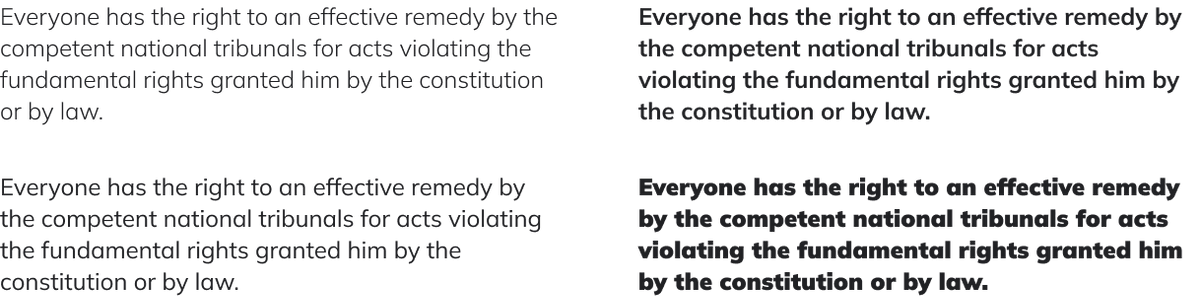
a bold geometric sans serif with display variations and a typesetting humanistic sans serif with smooth forms.
Web elements
Presentation templates

Social media


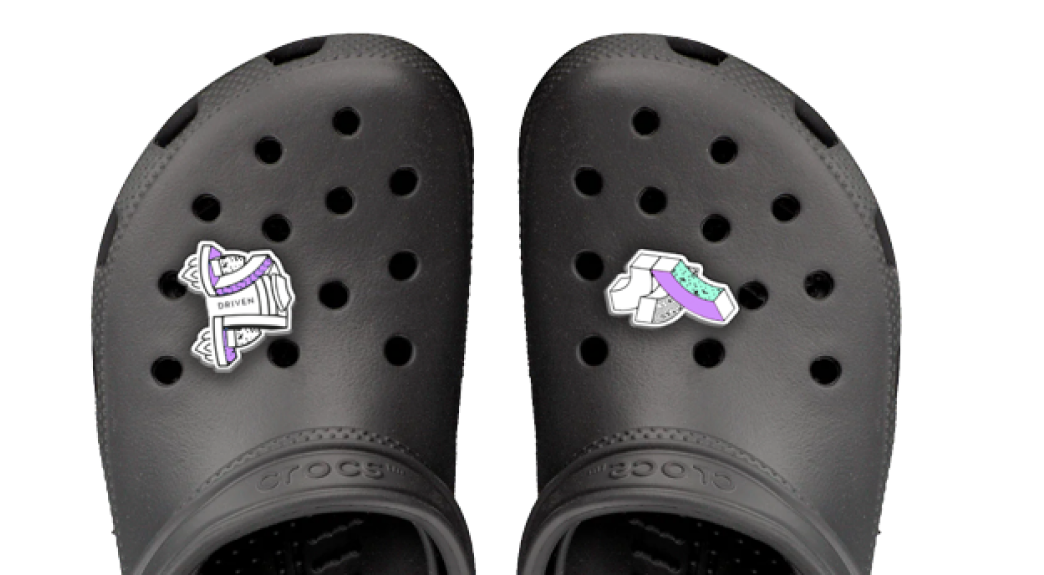
Merch


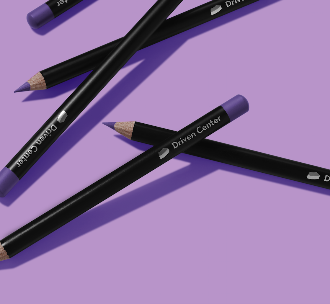
Since the logo is based on a 3D object, we use it as a basis for 3D souvenirs - stationery - colored stickers and puzzle cubes.


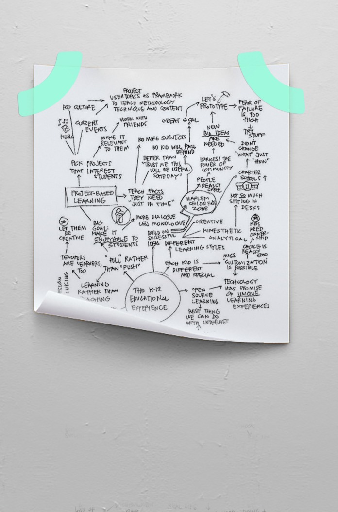
We developed the design and layout of the center's multi-page website. The site will include structural pages with information about the center and template pages for events and content, which are filled in by the center team as it develops.

Creative group:
Identity, art direction - Anton Bondarev, Natalia Grebenshchikova
Website layout - Ilya Lenkhinovich