Identity of HR-brand O’stin
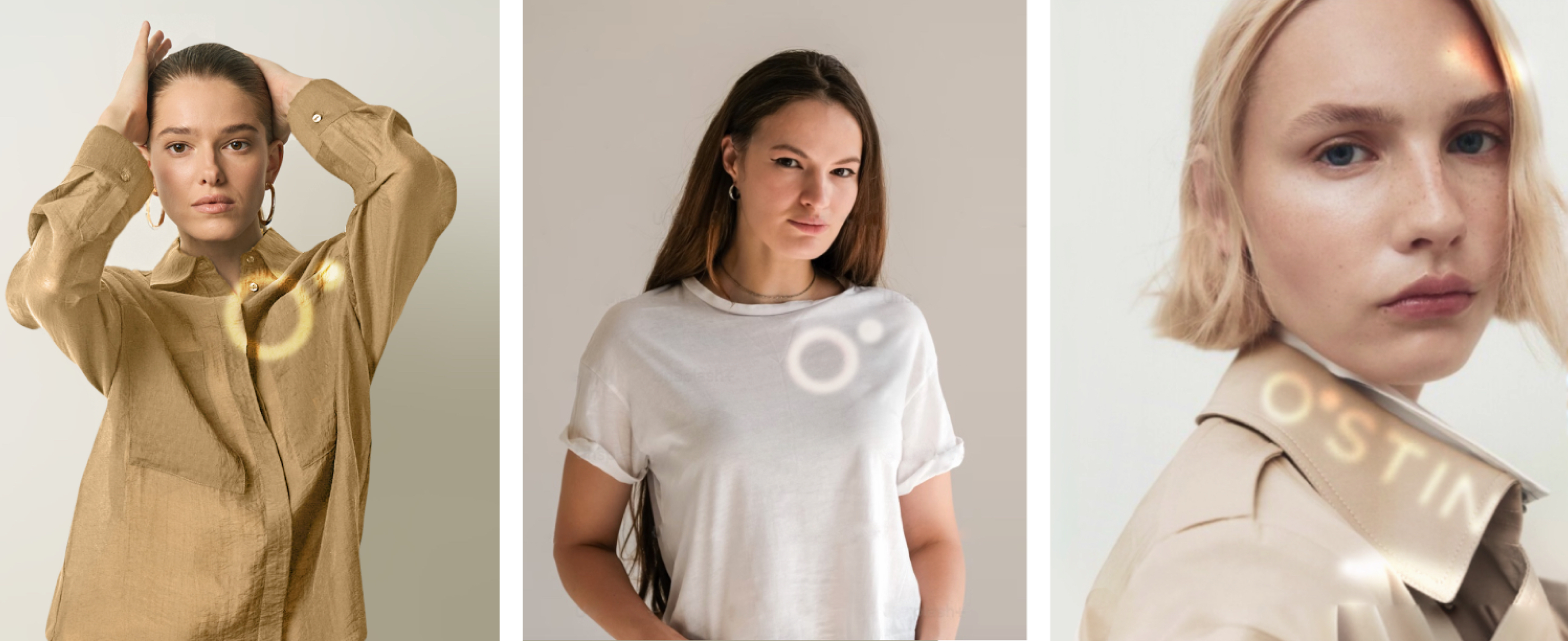
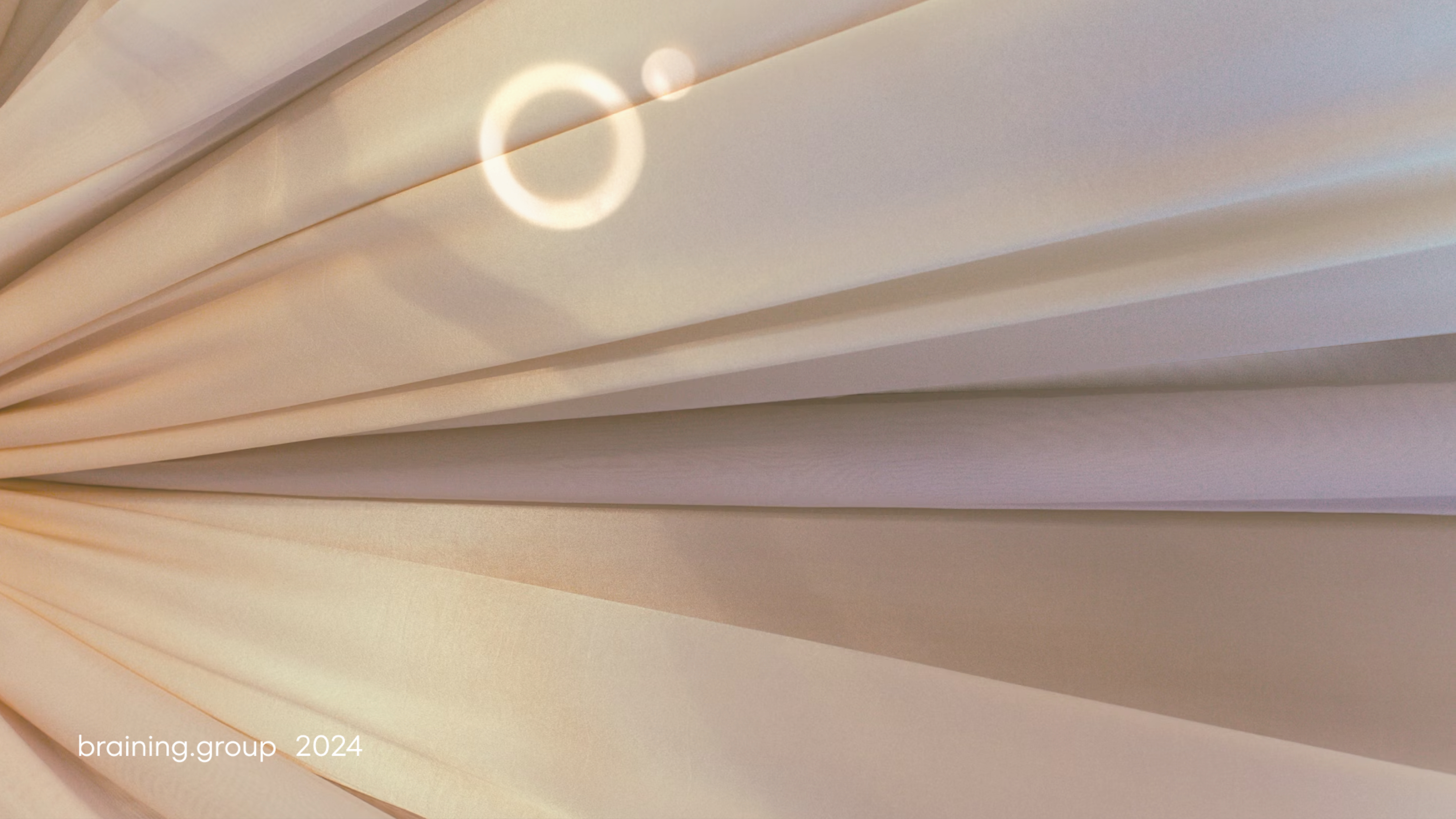
The visual identity of the HR Brand for one of the largest fashion retailers in Russia was created by order of the HR branding agency Braining Group based on a strong strategic component. The essence of the employer brand is a passion for fashion. The general slogan is “Made in O’stin”. We created a visual concept based on sunlight as a metaphor for warm internal communication and passion for the profession and each other.
The logo is a sun bunny in the form of the first symbols of the main brand logo.
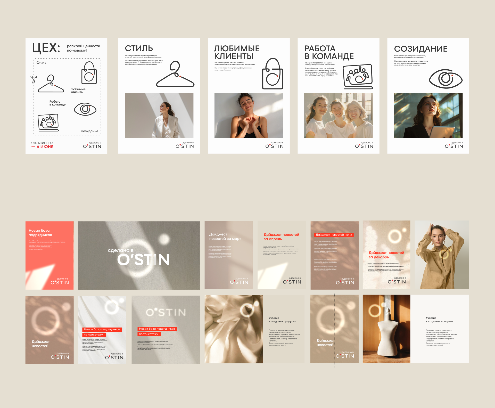
Numerous communication materials and documentation were filled with sunlight in the form of graphic and photographic elements.
Principles have been developed for creating key visuals for recruiting campaigns - while maintaining recognizable elements of the main brand (active red stripe) and for internal communication campaigns - with a softer and more balanced color palette.
Key visuals for recruiting campaigns are designed for different segments of the target audience - employees of the creative department, office and retail.
Photos with contrasting sun spots are transformed into branded content that can be easily found on stocks and used in SMM and daily internal communications of the company.
Merch
We use reflective materials to create original accessories, clothing, interiors and jewelry.
The main page of the company's internal portal and the brand page in the job search engine are designed in the same style.
Welcome
to the warm team!
Creative group:
Identity, art direction - Natalia Grebenshchikova
Designer POSM - Nadin Rozhkova
Identity of HR-brand O’stin
The visual identity of the HR Brand for one of the largest fashion retailers in Russia was created by order of the HR branding agency Braining Group based on a strong strategic component. The essence of the employer brand is a passion for fashion. The general slogan is “Made in O’stin”. We created a visual concept based on sunlight as a metaphor for warm internal communication and passion for the profession and each other.

The logo is a sun bunny in the form of the first symbols of the main brand logo.


Numerous communication materials and documentation were filled with sunlight in the form of graphic and photographic elements.

Key visuals for recruiting campaigns are designed for different segments of the target audience - employees of the creative department, office and retail.


Principles have been developed for creating key visuals for recruiting campaigns - while maintaining recognizable elements of the main brand (active red stripe) and for internal communication campaigns - with a softer and more balanced color palette.

Photos with contrasting sun spots are transformed into branded content that can be easily found on stocks and used in SMM and daily internal communications of the company.

Merch
We use reflective materials to create original accessories, clothing, interiors and jewelry.


The main page of the company's internal portal and the brand page in the job search engine are designed in the same style.

Creative group:
Identity, art direction - Natalia Grebenshchikova
Designer POSM - Nadin Rozhkova