

Sandalwood
Natural skincare products for urban women who long for the bright emotions and sensations of traveling to hot countries, the scents of wild nature, and exotic shores.


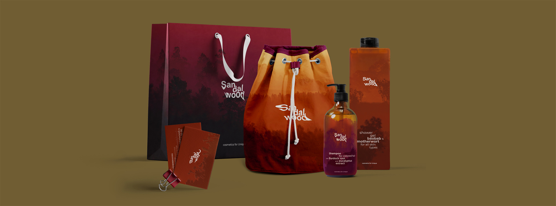
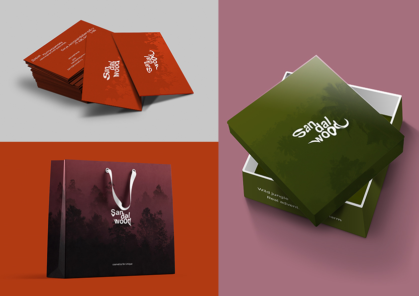
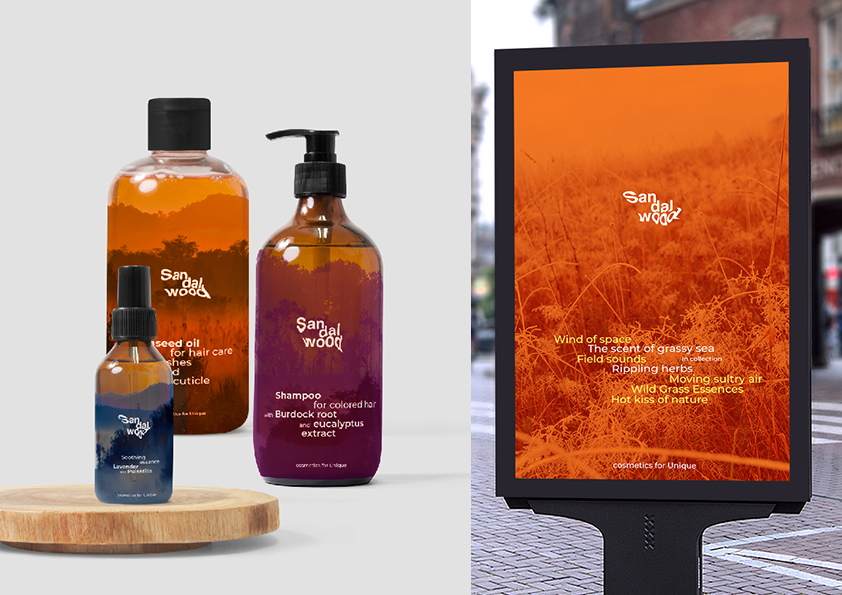
Sandalwood is a self-initiated concept: the brand doesn’t exist in reality, so there was no client — Wave simply wanted to make it. Wave built a brand platform, identity and packaging design for a cosmetics series. Its interest is conceptual: the identity rests on kinetic, generative typography — a fashionable device now, but a novelty when this was made. Wave used motion to give the type a kinetic effect, and the dynamic identity was built on that moving typography, set against a very digital, cold element for contrast. The type moves like hot, melting air — the shimmer that blurs space in a hot climate and splits what we see — while natural patterns based on the silhouettes of exotic landscapes, in very natural colors, ground it; that heat-haze effect is the core of the whole thing. The material work matters too: transparent films in solid colors combine with the transparent texture of the shampoos and with transparent plastic, so the packaging shimmers across all these layers and reinforces the metaphor. Wave first branded it and then rebranded it, after finding a stronger metaphor. Being a concept rather than client work, it is not under NDA.