What a brand identity includes
A brand identity is the visual system of a brand. Every identity Wave makes has a color palette, a logo and a typographic device. Illustration style, photo style, a mascot, motion techniques, patterns and textures are added when the idea of a particular brand calls for them. The applications (website, social media, templates, merch, packaging) are chosen for what the business needs now; we don’t have a fixed list. People recognize a brand by its key element, and that is far from always the logo.
By Natalya Greben, founder of Wave
Identity or corporate style
Small businesses often call it corporate style or brand style, while designers and companies with established brands say identity. In practice it is the same thing. The difference is in what a designer implies by “identity”: that there is a brand platform or brand strategy underneath the system.
Logo and identity
A logo is the mark that stands for the brand. An identity is the whole visual system the mark lives in, together with color, typefaces, graphics and the rules for combining them.
We don’t take “just a logo” requests. Usually they come from founders who haven’t yet worked out what they need, and it is too early to offer them an identity.
What every Wave identity has
Color palette. One, or several if the brand has sub-brands.
Logo. It can be dynamic and change from one application to another. It is always there, even when it plays a minor part in recognition: a mark usually has to be registered as a trademark.
Typographic device. Typography is my specialty, so no Wave identity goes without one. Dancing letters are my thing)
Depending on the project, we add an illustration style, a photo style, a mascot, motion techniques, a pattern or textures. Each appears when the brand idea doesn’t come together without it.
The key element: the basis of visual recognition
Many clients are sure the logo is always the main thing in an identity. The key element is whatever people recognize the brand by first, the part that carries the most weight in recognition. It can be the logo, which is the most common and perfectly normal setup. It can just as well be a color, a pattern, an illustration style, a shape or a typographic device.
Color.
Tiffany’s blue box is recognized without any lettering.
Milka’s lilac. I designed promo packaging for Milka when I worked in advertising.
Hermès’ orange box.
Pattern. The Burberry check, the Louis Vuitton monogram.
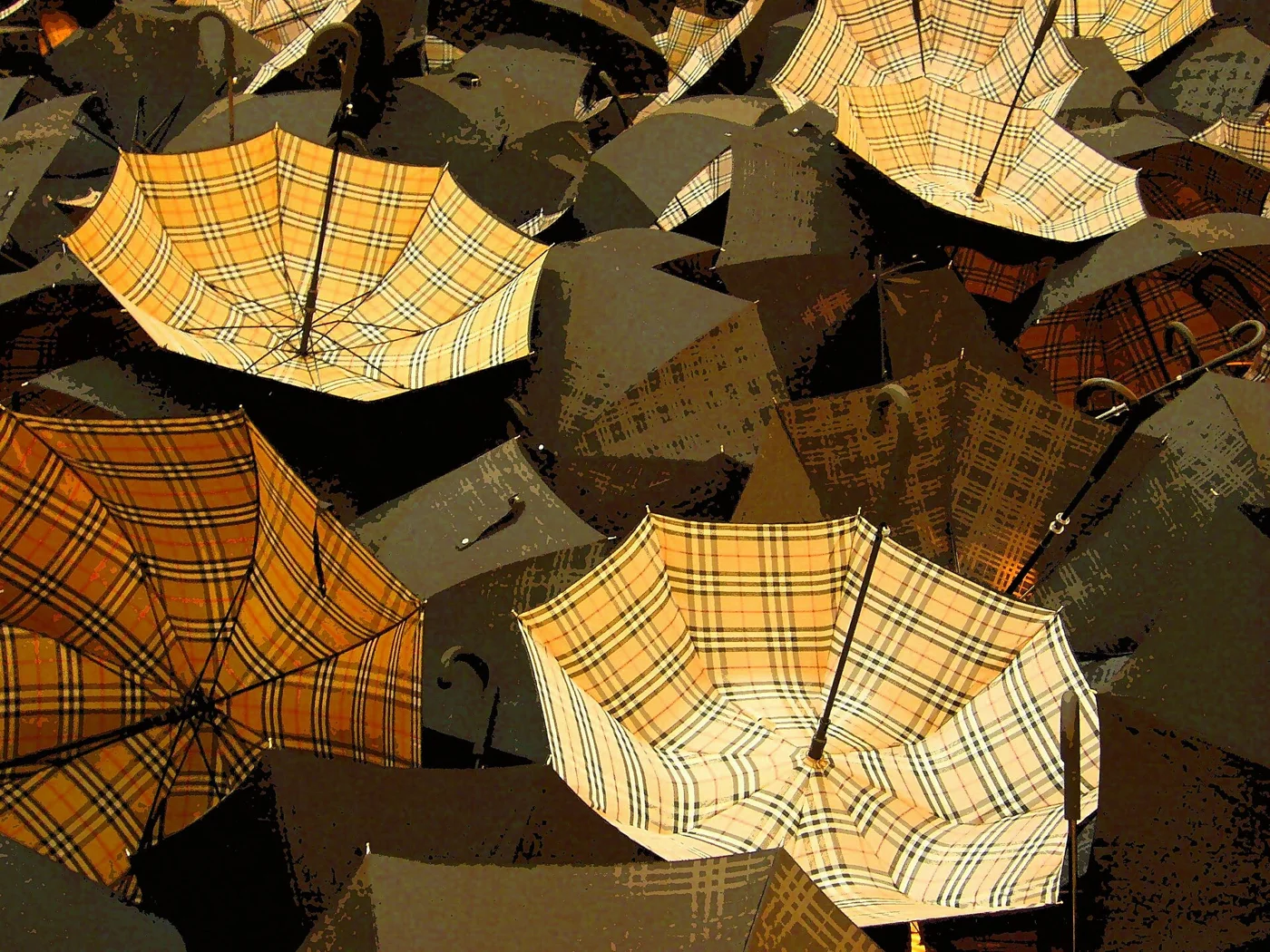
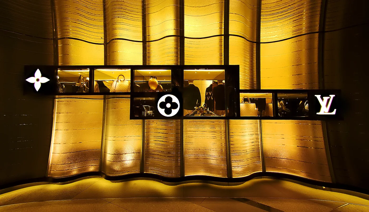
Burberry: Kok Leng, Maurice Yeo, CC BY 2.0 · Louis Vuitton: Erwin Soo, CC BY 2.0 — Wikimedia Commons, resized
Illustration style. Dropbox: people recognize its drawings before the logo.
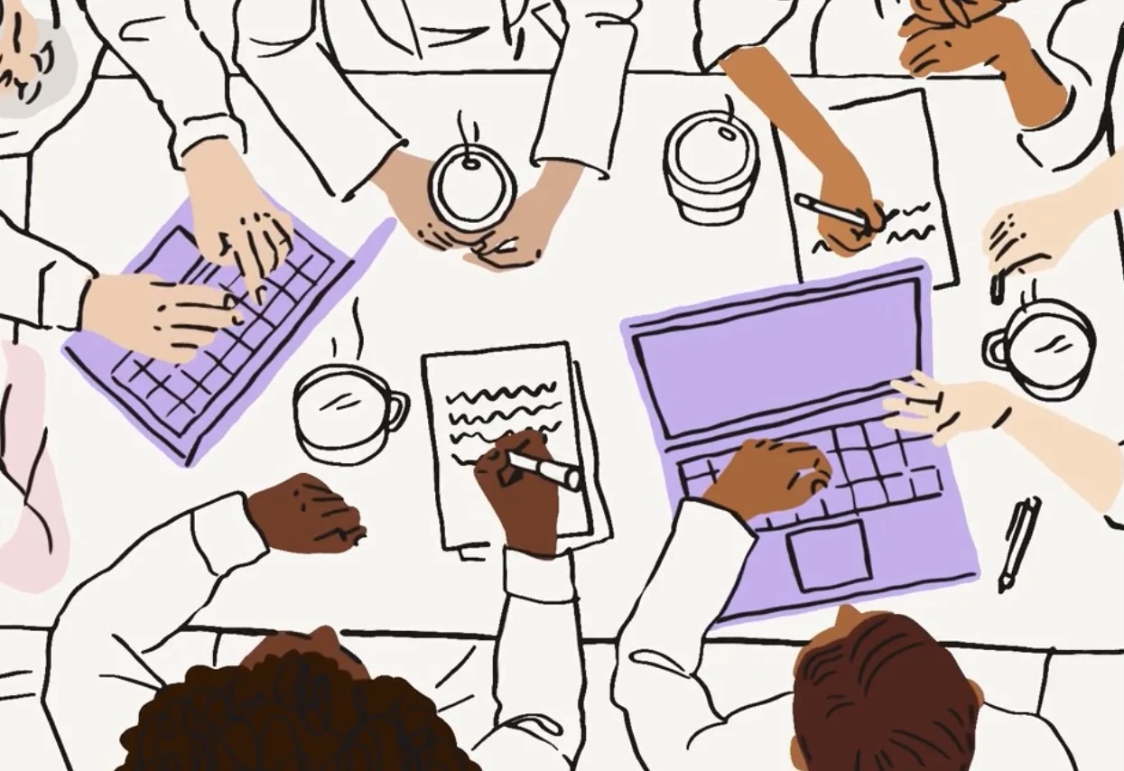
© Dropbox — brand.dropbox.com
Photo treatment. Spotify’s duotone.
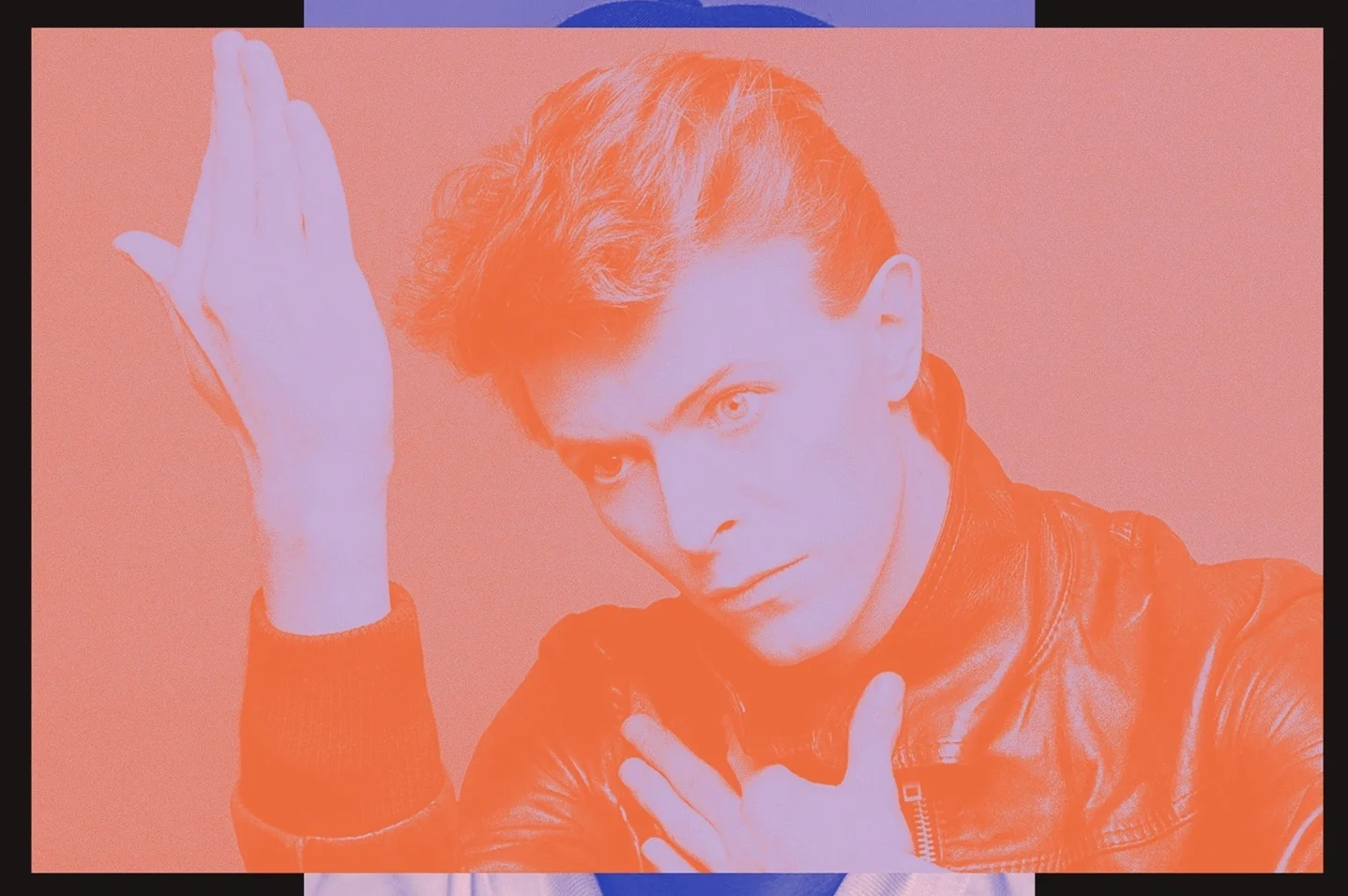
© Spotify, identity by COLLINS
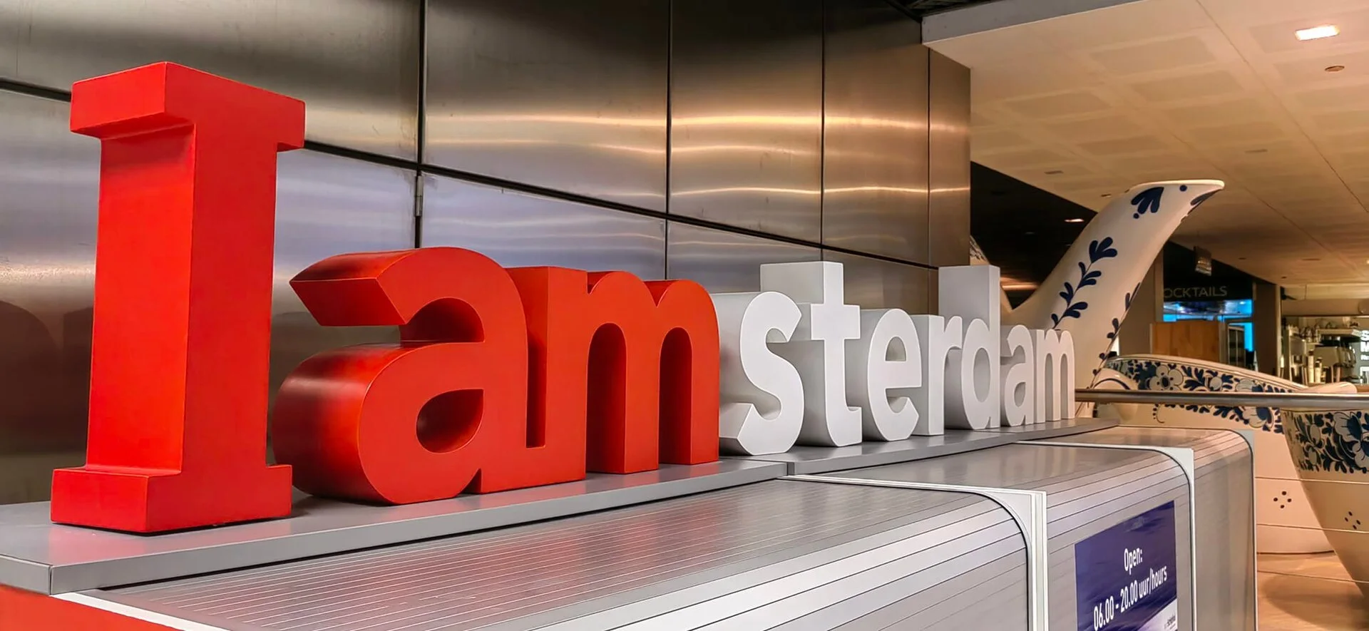
Typography. I amsterdam: lettering that became a symbol of the city.
Shape. The Absolut bottle, the triangular Toblerone bar.
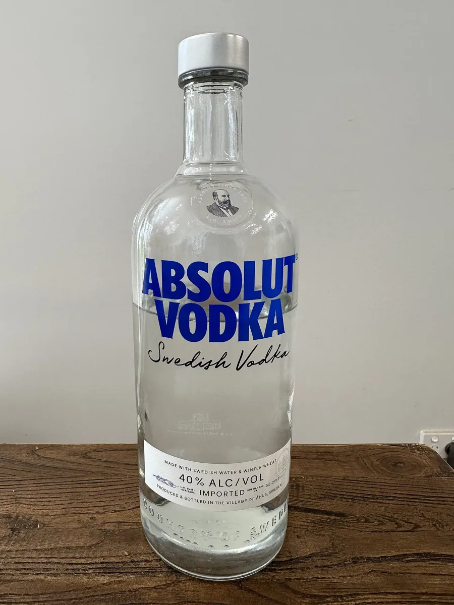
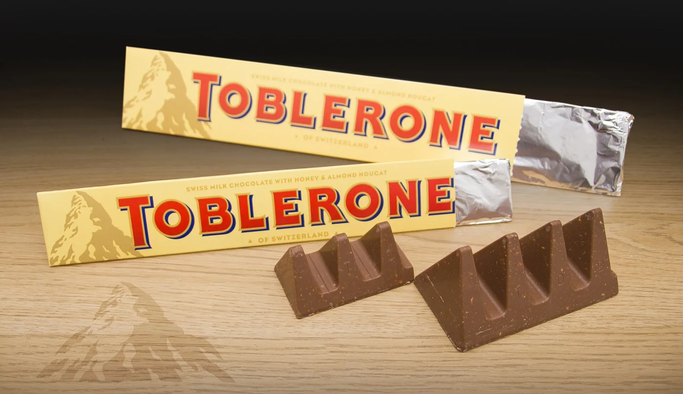
Absolut: Indrajit Das, CC BY-SA 4.0 · Toblerone: George Gillams, CC BY-SA 2.0 — Wikimedia Commons, resized
And examples from Wave projects. Each one shows the same element working across different applications.
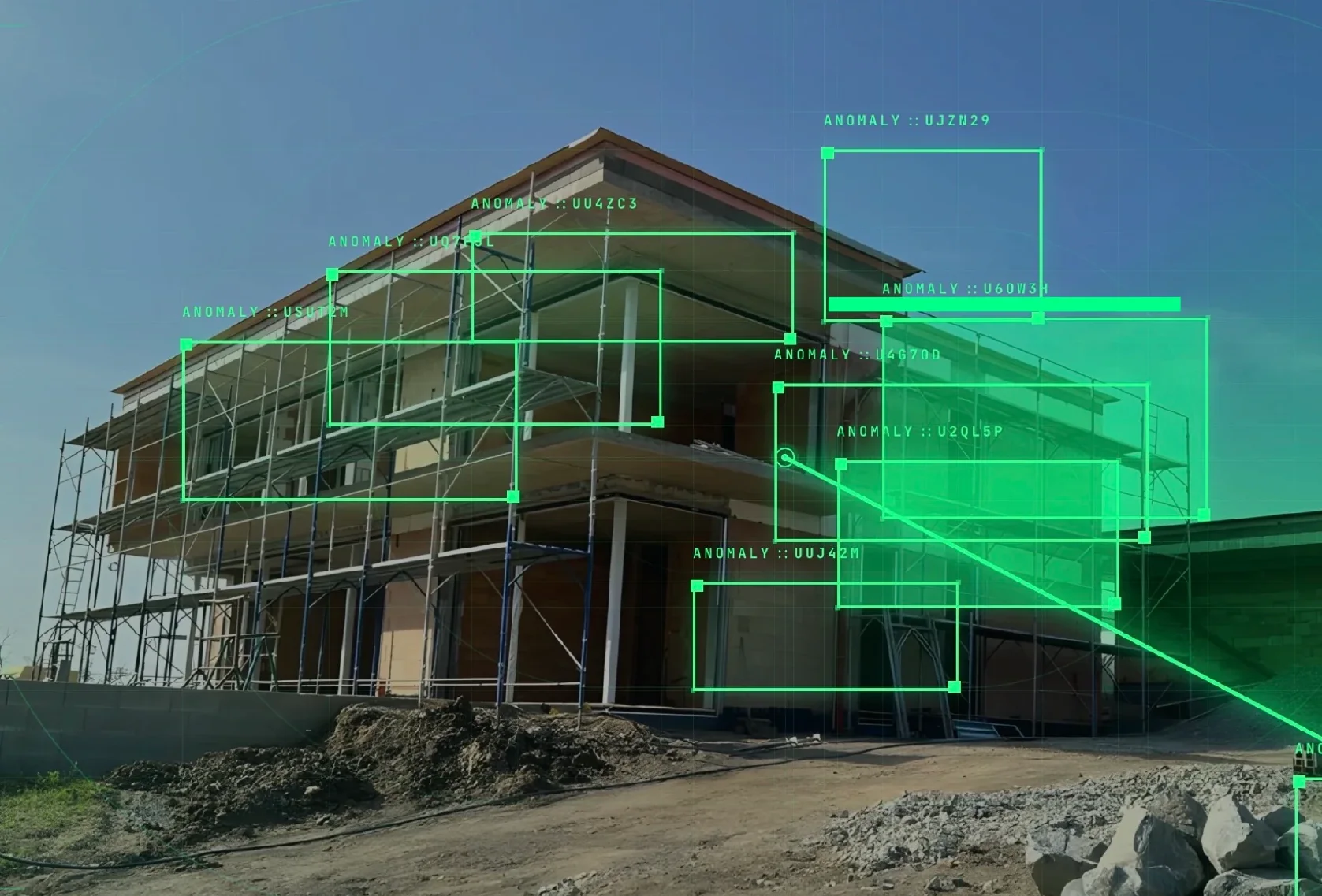
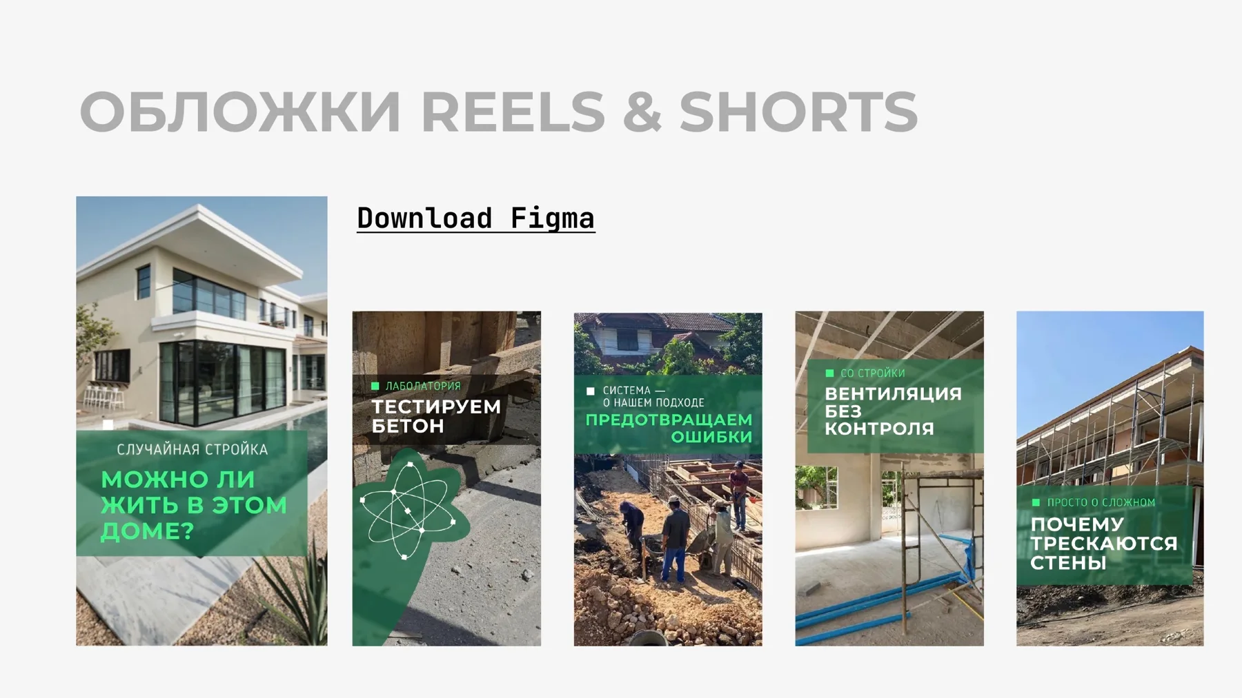
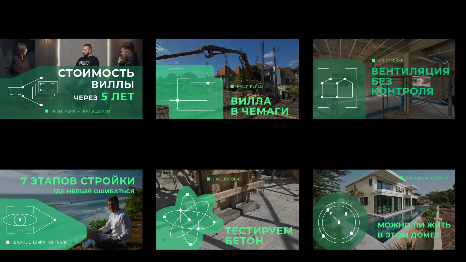
QCS, construction supervision in Bali. The key element is a set of selection frames that brand any image. In videos the frames move, but people recognize the brand by the frames themselves.
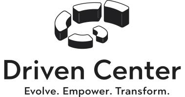
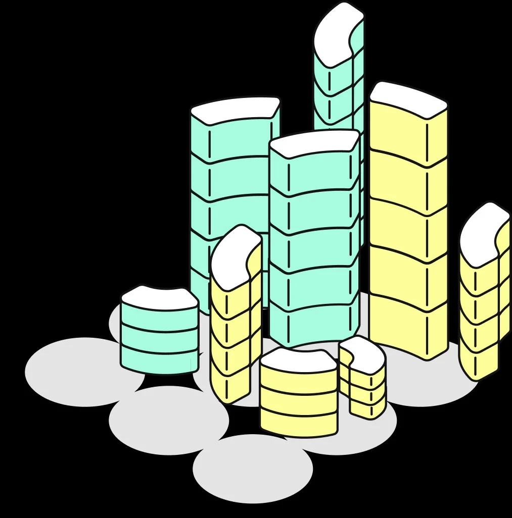
Driven Center, a corporate retreat center. The key element is a construction kit made of the parts of an axonometric logo. Both the logo and the illustrations are assembled from it.
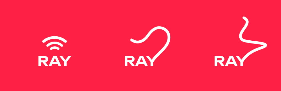
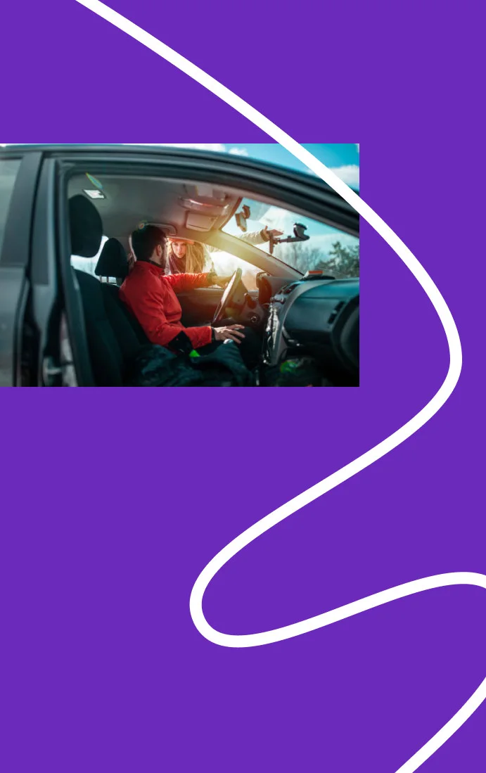
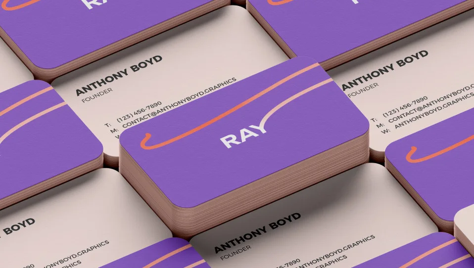
RAY. The key element is a cheetah mascot, and most often it works through the moving tail woven into the logo.
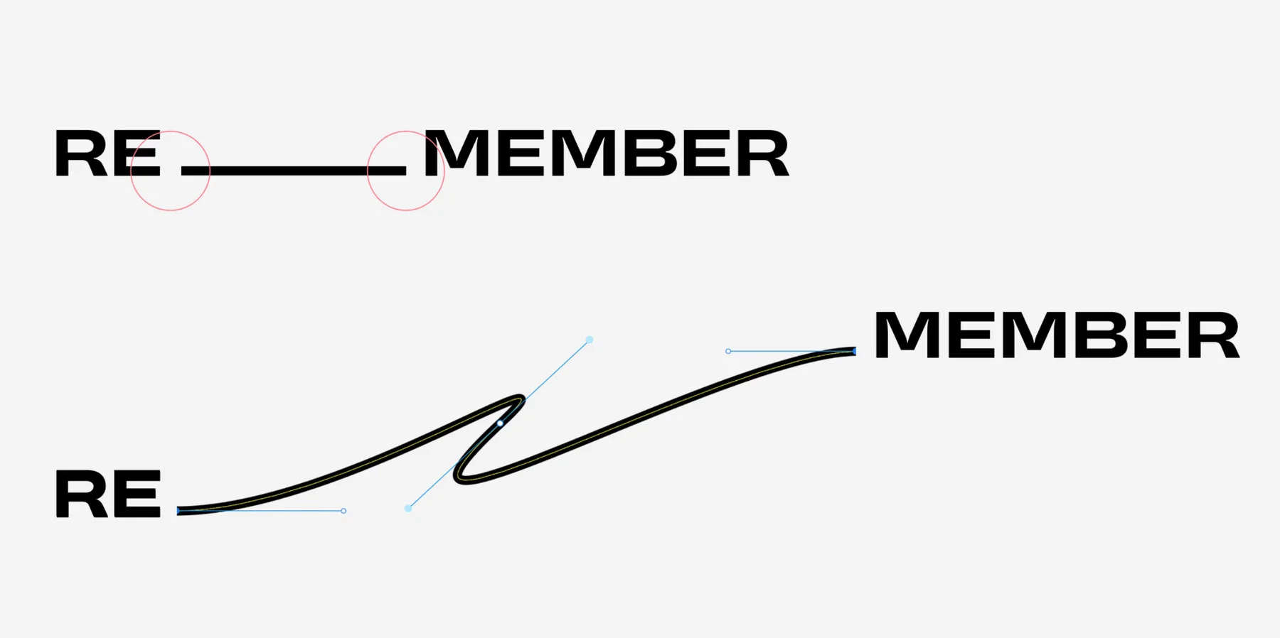
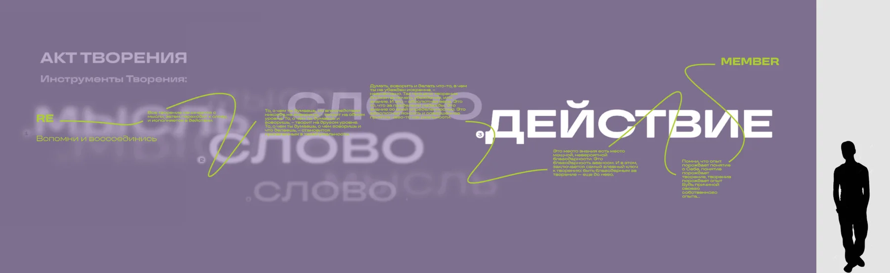
Remember, an exhibition at MARS, one of the best-known contemporary art centers in Moscow. The key element is a device that links blocks of text with a line, sometimes straight, sometimes curved. It is in the logo too, but it runs through all the typography, so the device itself became the key element.
Minimal and full identity
A minimal identity suits a business that is just launching and has limited resources at the start. It can go the other way: the founders of Driven Center had extensive corporate experience and solid investment, and they started with full branding right away. Not everyone has that option.
A minimal identity includes the core set (palette, logo, typographic device) plus an additional element if the brand idea calls for one; it may well turn out to be the key element. And one application, the most important for this business, usually as a mockup. It can be a sign, a presentation template or a branded car in a visualization: we don’t produce the print-ready vehicle wrap in this case, but you can see how the system works in real life. A website is not part of this set; it is a separate, large piece of work.
Example: Signal. The key element is a pulse: light signals flicker in the rhythm of Morse code, and the fund builds key visuals and list markers in presentations out of them. The typographic device went into the logo and the headlines, and the fund’s team reproduces it themselves. Plus the palette, a video with the pulse animation and several layouts of a presentation template.
A full identity is a system tested on several applications.
QCS: Instagram and YouTube design, animated section icons, a motion intro, Reels, a guideline. And generative tools in which the client’s team assembles on-brand posts and videos from a short brief. QCS Reels are technically complex: engineering diagrams, animation, a lot of technical information in one video. A content maker films a regular talking-head Reel in half an hour or a couple of hours; a video like this used to take about a week. With the tools it takes about a day. We also made the QCS website, but it was priced separately.
Driven Center: a logo with five variations, illustrations made from its parts, web elements that later went into the website, presentation and social media templates, herbal tea packaging, merch.
Signal got a system and proof that it works: the fund’s team sets the headlines themselves and orders business cards or a new presentation when they need one. QCS got a system spread across every channel where the company talks to clients every day, plus tools to publish content without a designer on every post. You can estimate the scope of your project in the calculator.
How we choose the applications
Founders usually know which applications they need. Their task is to solve a communication problem, for example to start running social media. Then it turns out that social media works when people recognize it and when it matches the website, which means an identity is needed. Dig a little deeper and a brand strategy is needed too. It is a layer cake.
We identify the applications in a conversation with the founder. We have long lists of what applications exist, and clients can go through them and mark their own. But we design only what the business needs now, and test the system on that. When something new is needed later, the client hires a contractor designer and gives them the visual guide. That costs far less than designing a huge set of applications up front.
There is a second reason: an identity needs to live in the real world. Within a few months some devices take root and others move to the background. RAY’s cheetah mascot had many forms: a face, spots as a pattern, a moving tail. In the end the face wasn’t used, because it was hard to work with, while the tail works everywhere. The cheetah stayed the key element; what changed is which part of it we draw. With neural networks designers now have more tools, so the face may come back yet)
Unusual applications
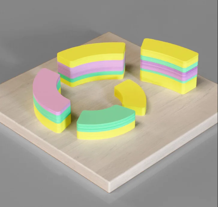
Driven Center sells corporate offsites for top management. For HR specialists, the center’s clients, we made a wooden construction set, like children’s blocks, but in the shape of the logo. The blocks come in the brand colors, which are also the most common colors of office sticky notes, so the gift fit the office aesthetic and still stood out.
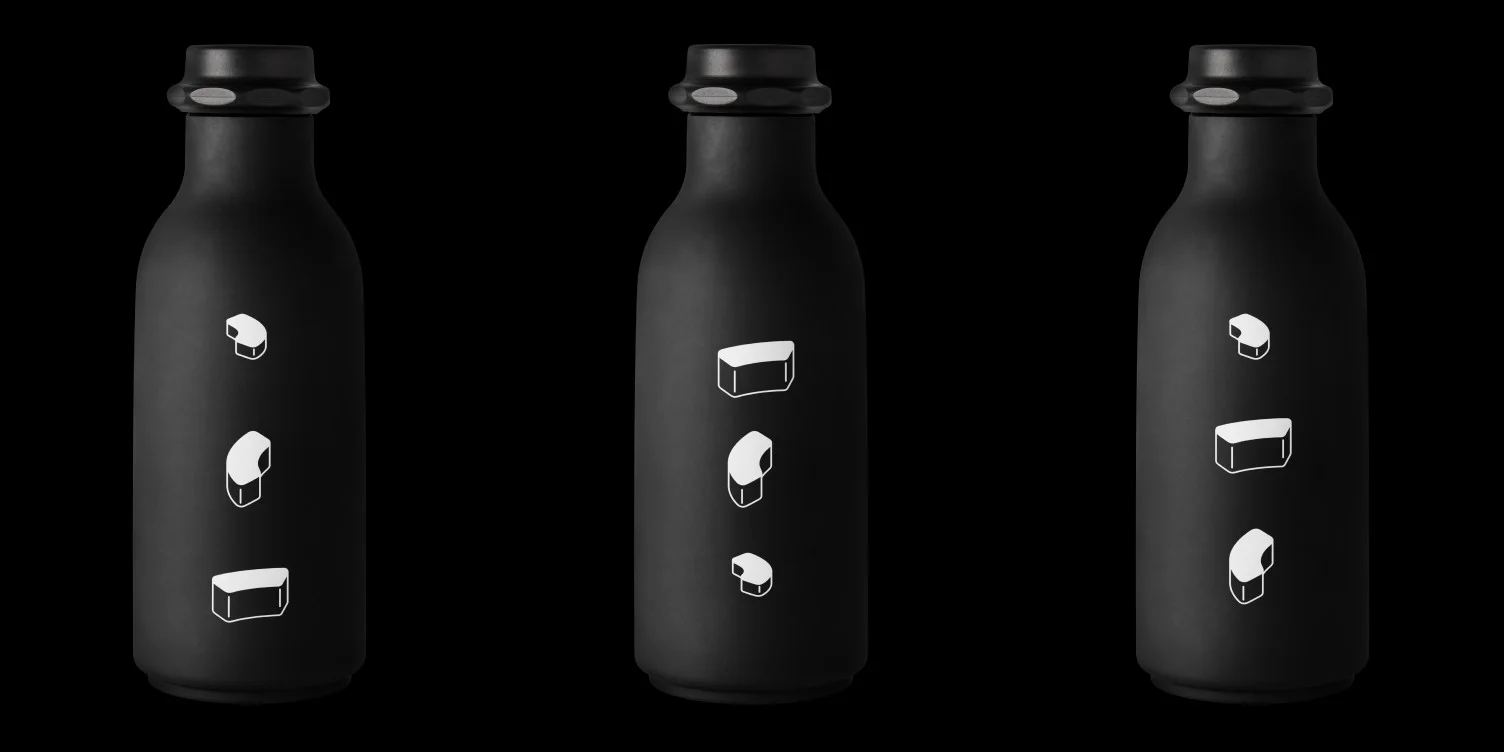
The second game is a shell game. The ball hides under bottles with cone-shaped bottoms, and the bottles carry parts of the brand construction kit. Driven is a healthy retreat center: ice baths, yoga, meditation and no alcohol. So the bottles wink at corporate team-building events where the mood is usually loosened up with drinks ;) Both games are simple and refer to the game mechanics HR teams use to bring people together.
For the Remember exhibition at MARS, a contemporary art center in Moscow, a whole hall became an application. Using the identity in interiors is a task for any commercial organization, especially a chain of stores or offices, and typographic compositions on walls are common in that kind of branding. Our twist was the key element: the text blocks were arranged so unusually that the wall was recognized at once. In Reels or stories filmed against it, it was clear where the visitor was. And someone watching that story could later see the poster (a different application), connect the two into one space and get curious about the exhibition.
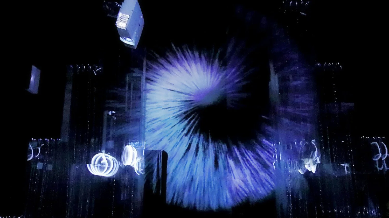
The most unusual thing in this project was the dynamic light projections. In the floor projection, the main device was our key element: lines linking blocks of text. It moved to music written specially for it and became the focal point of the whole exhibition. The second projection, also dynamic but calmer, ran across the wall.
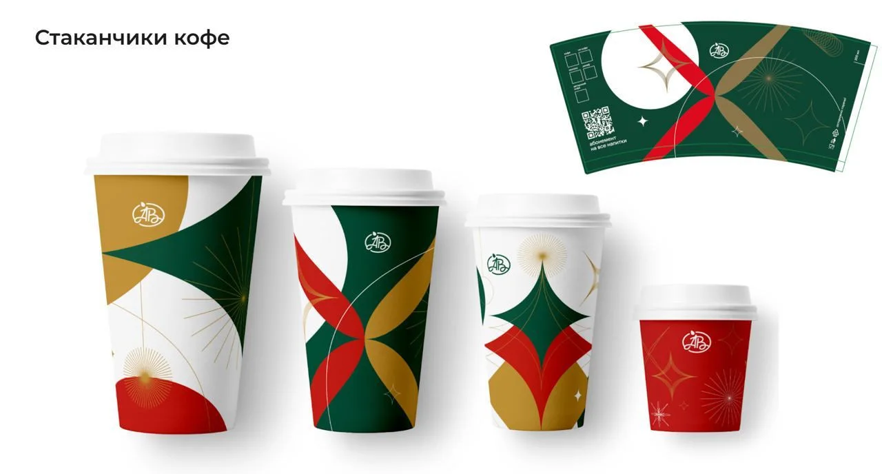
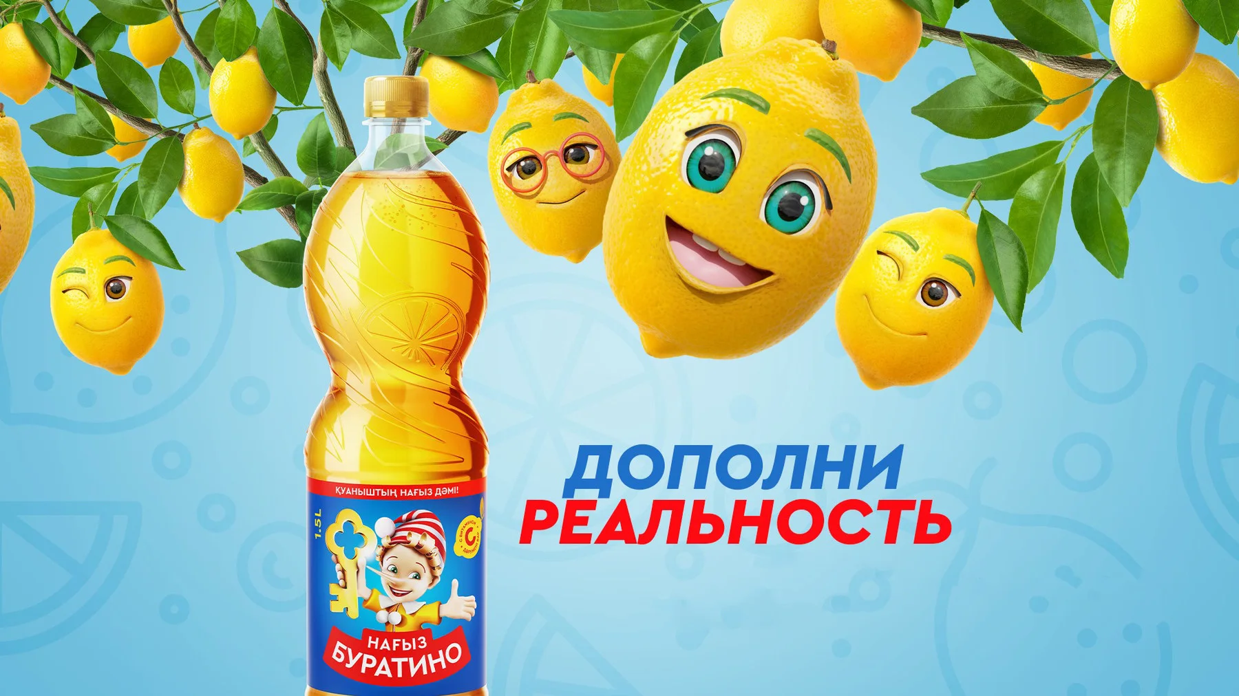
Another application people rarely think about is augmented reality. For the Azbuka Vkusa supermarket chain we designed cups and an AR promo activation on them, based on the chain’s existing style. For Buratino lemonade the augmented reality lived on the packaging: we animated the brand’s mascots and brought them into AR while keeping its identity.
And in 2026, oddly enough, business cards are back in fashion. We make those too, by the way)
Projects from this article
- Quality Control System
full identity with generative content tools for a construction supervision company in Bali
- Driven Center
dynamic identity, merch and packaging for a corporate retreat center
- Signal
minimal identity for a venture fund
- RAY
identity with a cheetah mascot for a family of apps for drivers
- MARS — Remember
exhibition identity, hall design and dynamic light projections
Need an identity? Write to us, or check the timeline and budget in the calculator.