Dynamic identity
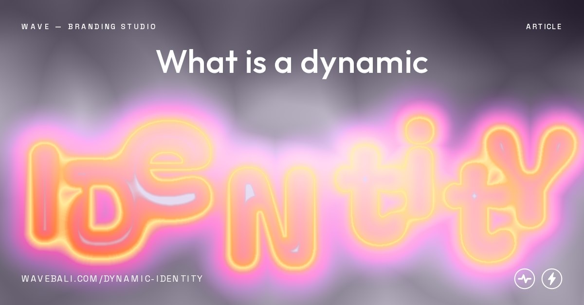
A dynamic identity is a visual system where a few elements and rules are fixed, while everything else can change: for example arrangement, color, form, motion and the behavior of elements. The rules make the brand recognizable, and the freedom keeps it from repeating itself or growing stale and makes it flexible to use. Below we show how these principles play out in our studio's own identity. You can try applying it yourself.
Interactive lab showing Wave's dynamic identity. The word "wAve" is built from metaball letters: each letter is a soft, glowing form colored like a thermal image, and letters merge when moved close to each other. Visitors can drag the letters, type their own word with digits and symbols, switch between three palettes (Main, Light, Dark) and switch the cell background off or between dark and light membranes. A science layer with an ultrasound scale, pulse and lightning icons and coordinates stays on top in every state.
Any identity is built on a creative idea, and the direction for finding it is set at the brand strategy stage.
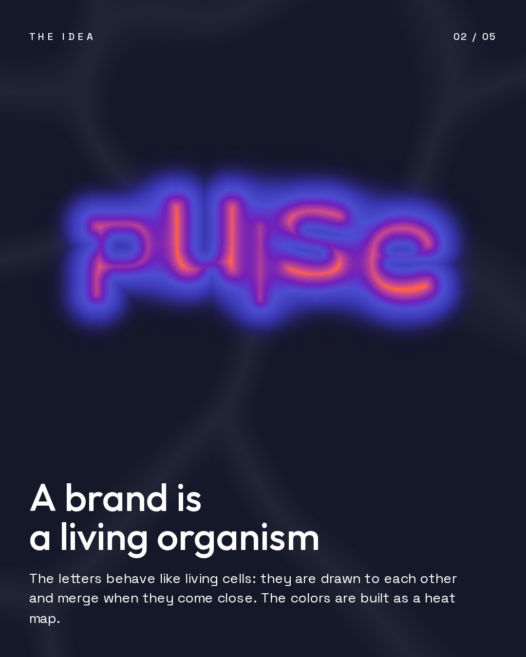
Our idea: a brand is a living organism
Our slogan is Brands With a Pulse, and the identity takes it literally. The letters behave like living cells: they are drawn to each other and merge when they come close. The colors are built as a heat map, the way living matter looks under a microscope. Behind them, in some places, there is a texture of cells.
Wave is a studio of strategic branding and experimental design, and for us every new brand we develop is an experiment. So the identity uses the style of a science journal: the screen reads like a report on an observation. The scale on the left comes from an ultrasound scan, the pulse icon from a heart monitor, and the lightning bolt marks the moment the energy of life is born.
The image is based on ultrasound scans of an embryo. The metaphor is emotional on purpose. For our clients a brand is close to a child: they put their heart into it, and it is more than a way to earn money. In our brand platform, the role model for our relationship with clients is the accomplice. We run the experiment together with the founder, and like doctors who know how much the future child means to its parents, we carefully help the brand take shape.
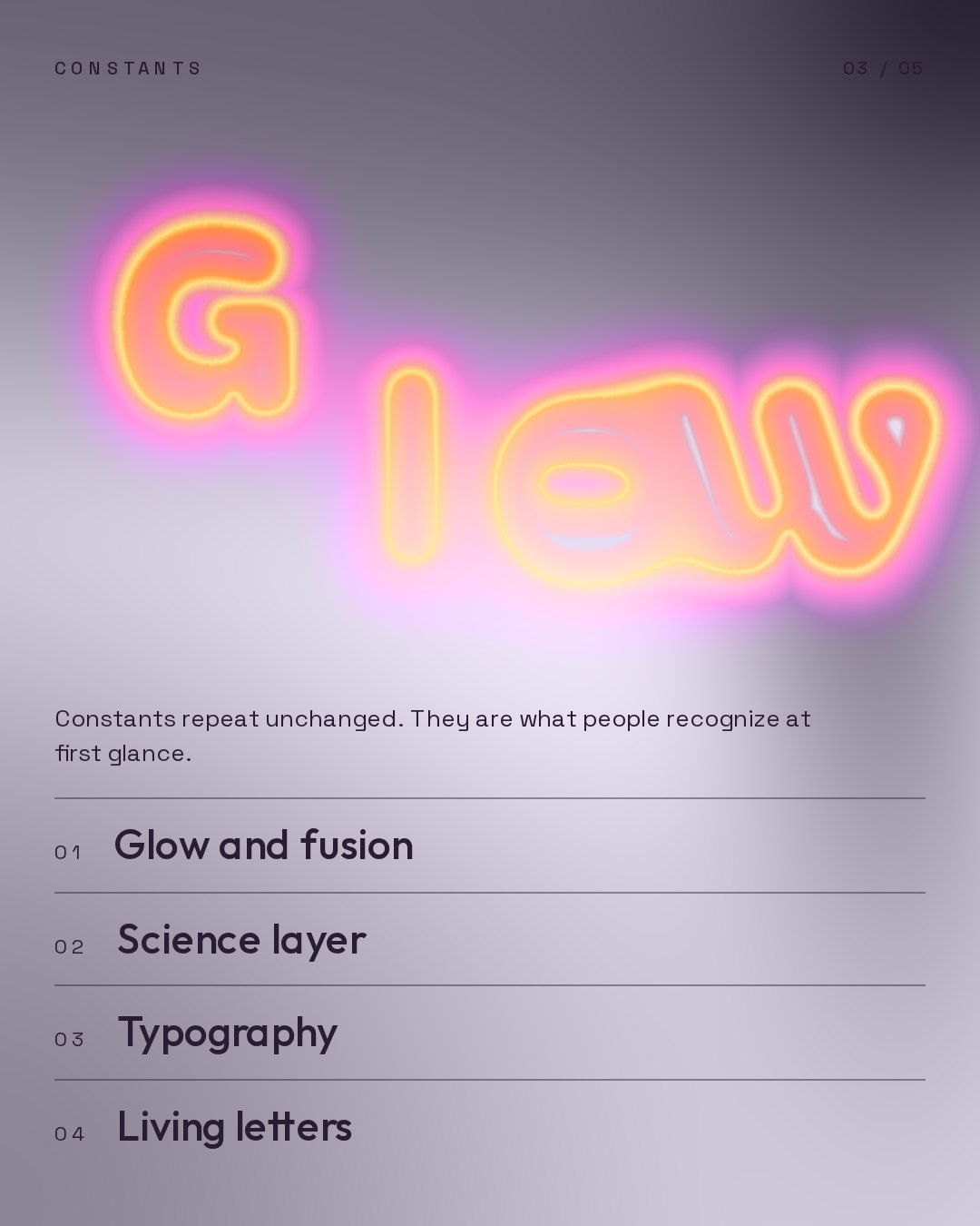
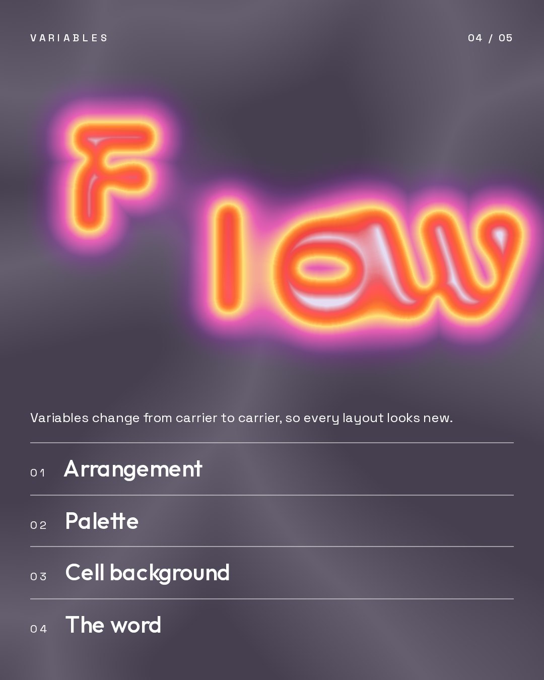
Any dynamic identity can be split into constants and variables. Constants repeat unchanged, and they are what people recognize at first glance. Variables change from carrier to carrier, so every layout looks new. Next, how these differences show up in Wave's identity.
Constants: what never changes
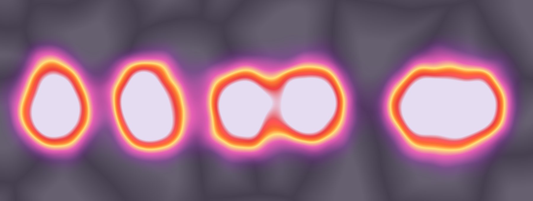
Glow and fusion
The main technique behind the core forms of the identity is a living substance: soft edges, a heat glow, merging on contact.
The science layer
On top of the image sit scales, measurements, pulse and energy icons and notes in small type, like the readout of a lab instrument.
Typography
Notes and captions are set in Space Grotesk, a calm technical grotesque that grew out of the monospace Space Mono (a typeface widely used for writing code).
The slogan and headings are set in Outfit, a geometric, balanced and fairly upscale sans. Next to the living letters both typefaces look restrained, and the identity is built on that contrast.

The living letters are based on Bagel Fat One: a round, very bold typeface with thin joints. On its own it looks cartoonish, like graffiti for teenagers; that style doesn't suit us, and we never set text in it. Under the glow, though, its geometry turns into exactly that living matter, which makes it ideal raw material for “living typography”.
In a static identity almost everything is fixed: the logo, the colors, the layout grid, and every new carrier repeats them. In a dynamic one only a few elements are fixed, and the rest is given over to variables.
Variables: what changes
Arrangement
The letters can move anywhere in the format. Each layout is new, and the word still reads.

Palette
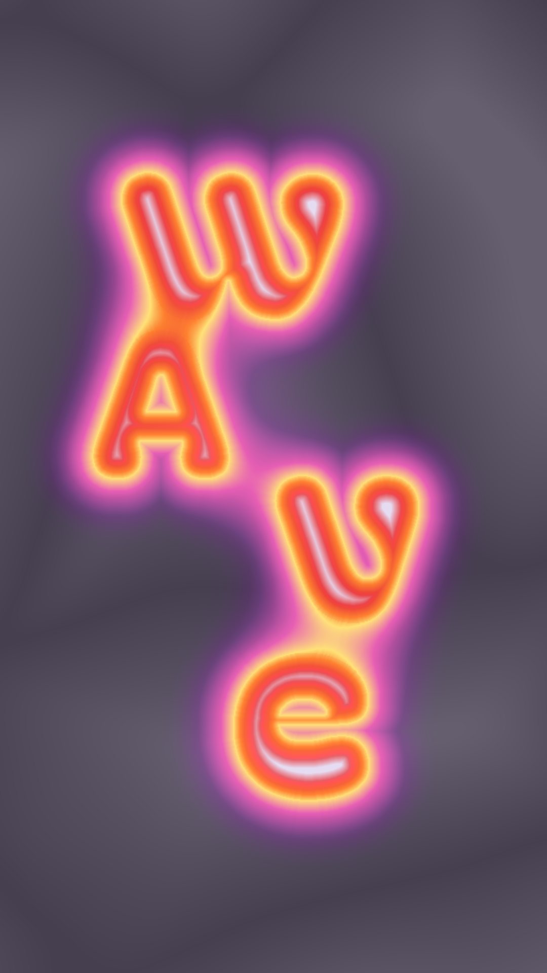
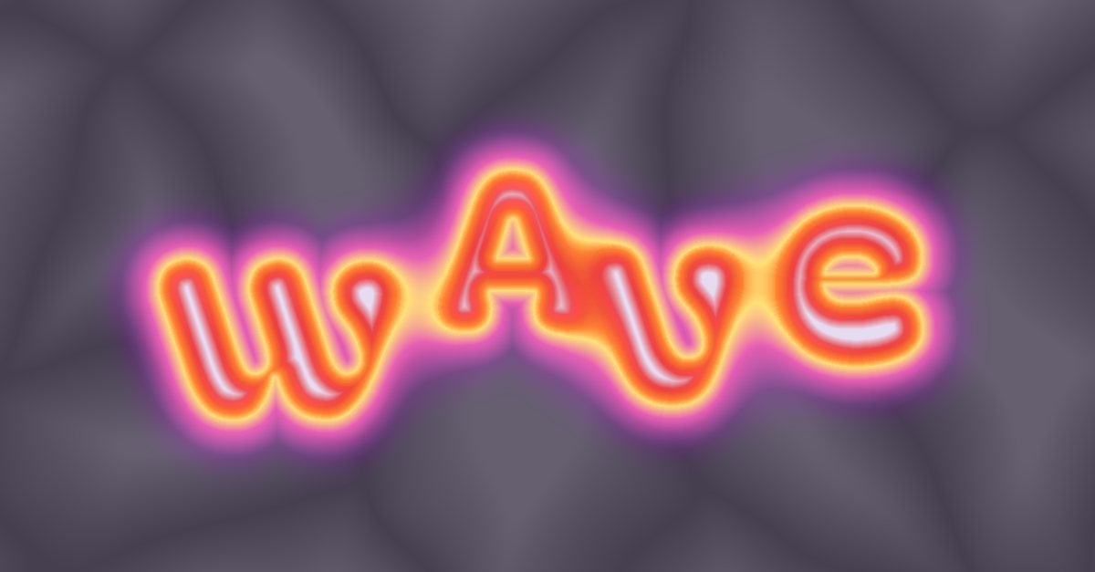
Three heat-map palettes from one set: Main and Light are used on the site's pages, Dark in Deep Dive, a separate studio product. The palettes go together but differ, and the set can grow as sections and products are added, while the brand remains one.



Cell background
It appears in some places and disappears in others. Its membranes can be light with dark centers, or dark with light ones. The background can be static or animated.
The word
The rules aren't tied to the letters W, A, V, E. Type any word in the lab above, with digits and symbols too, and it will behave the same way.
Variables don't have to change only from layout to layout. An identity can also respond to a person right on the screen.
Interactivity
On our homepage the animation interacts with the visitor: the letters move, and a cursor or a finger leaves warm spots that merge with them. Interactivity is part of the living system too, and we use it for the places with the most weight. For now that is the first screen of the homepage.
The identity on carriers
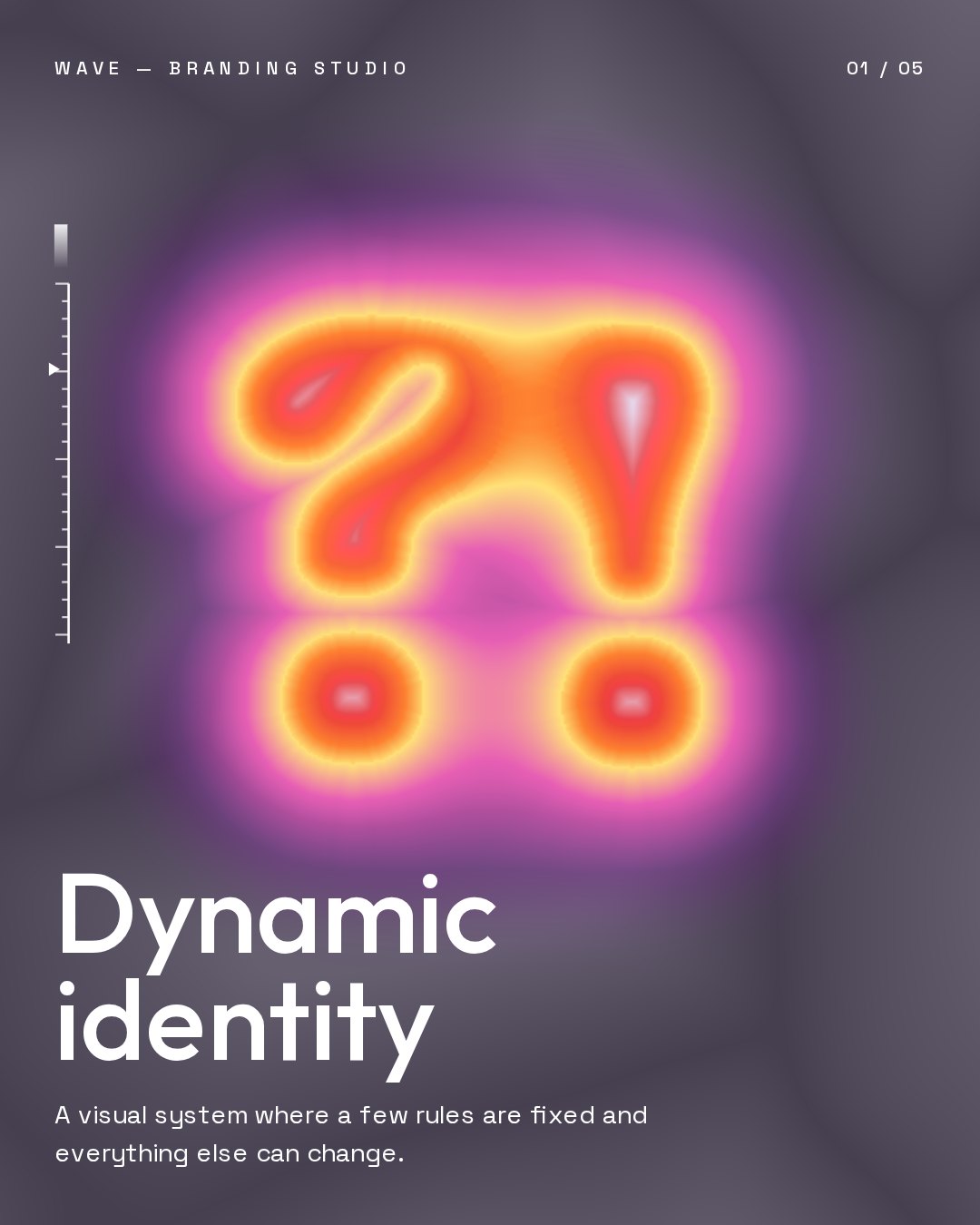
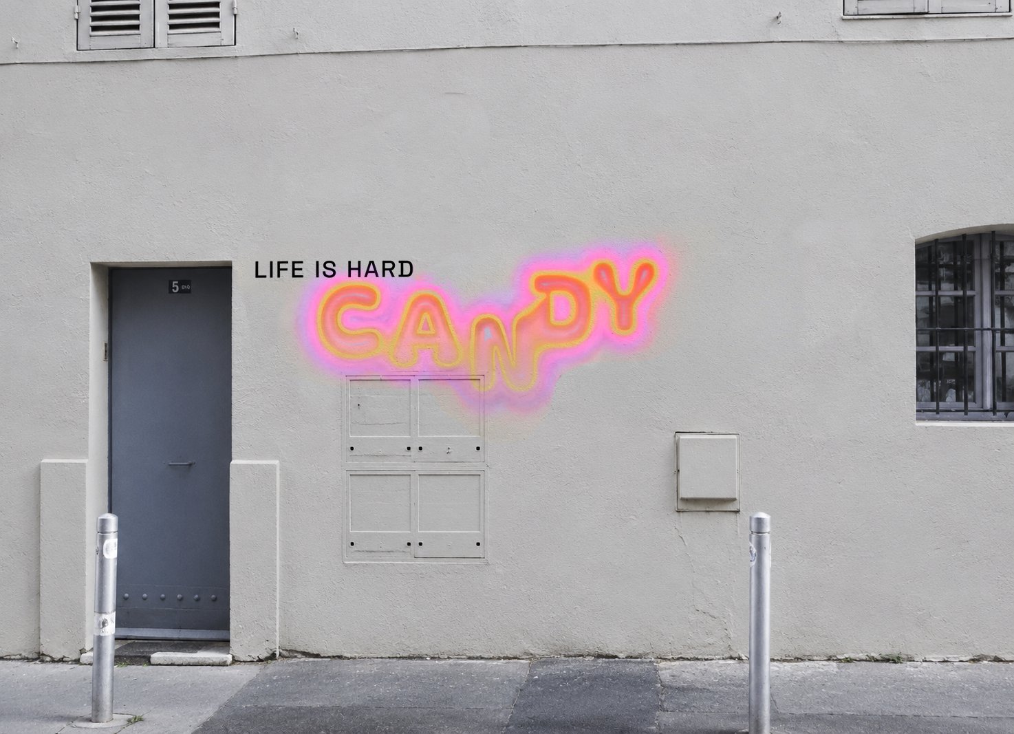
Constants and variables work on any carrier: in social media, on clothes, in the city. The palette, the word and the arrangement change; the glow, the science layer and the typefaces stay.
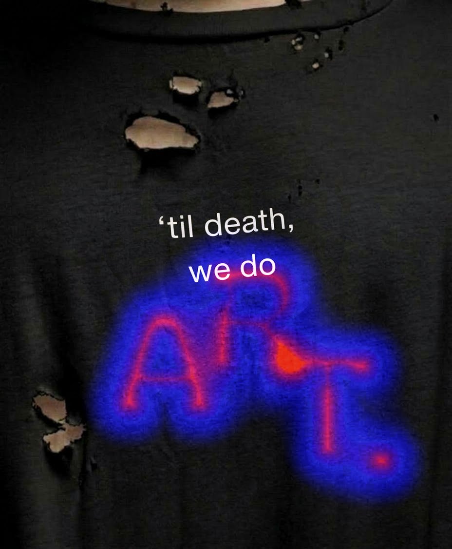
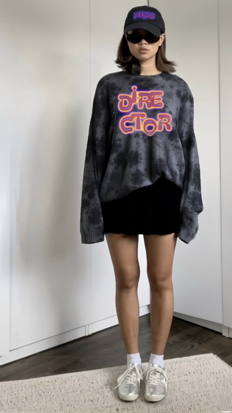
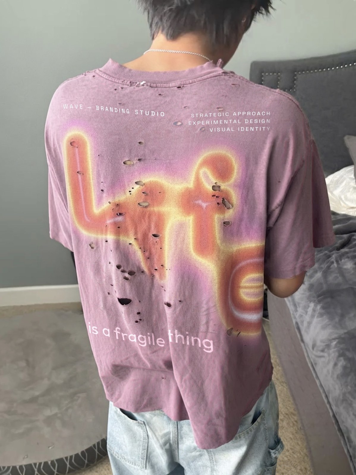
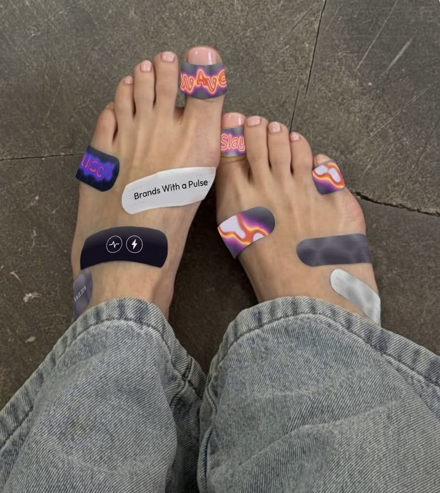
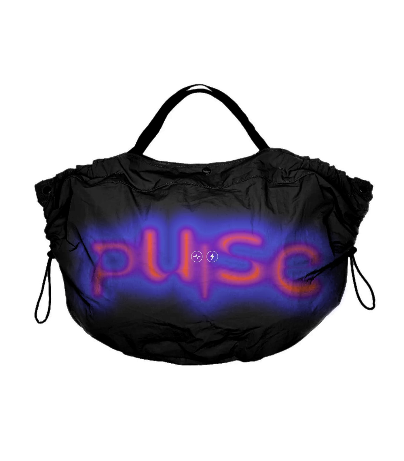
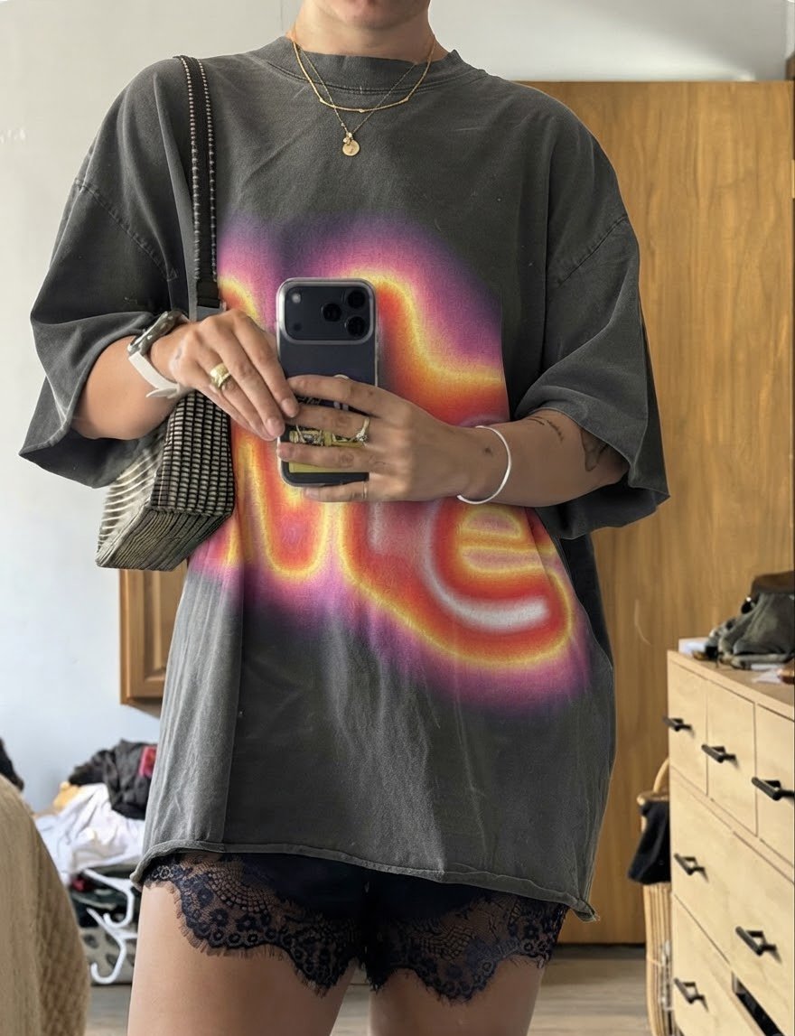
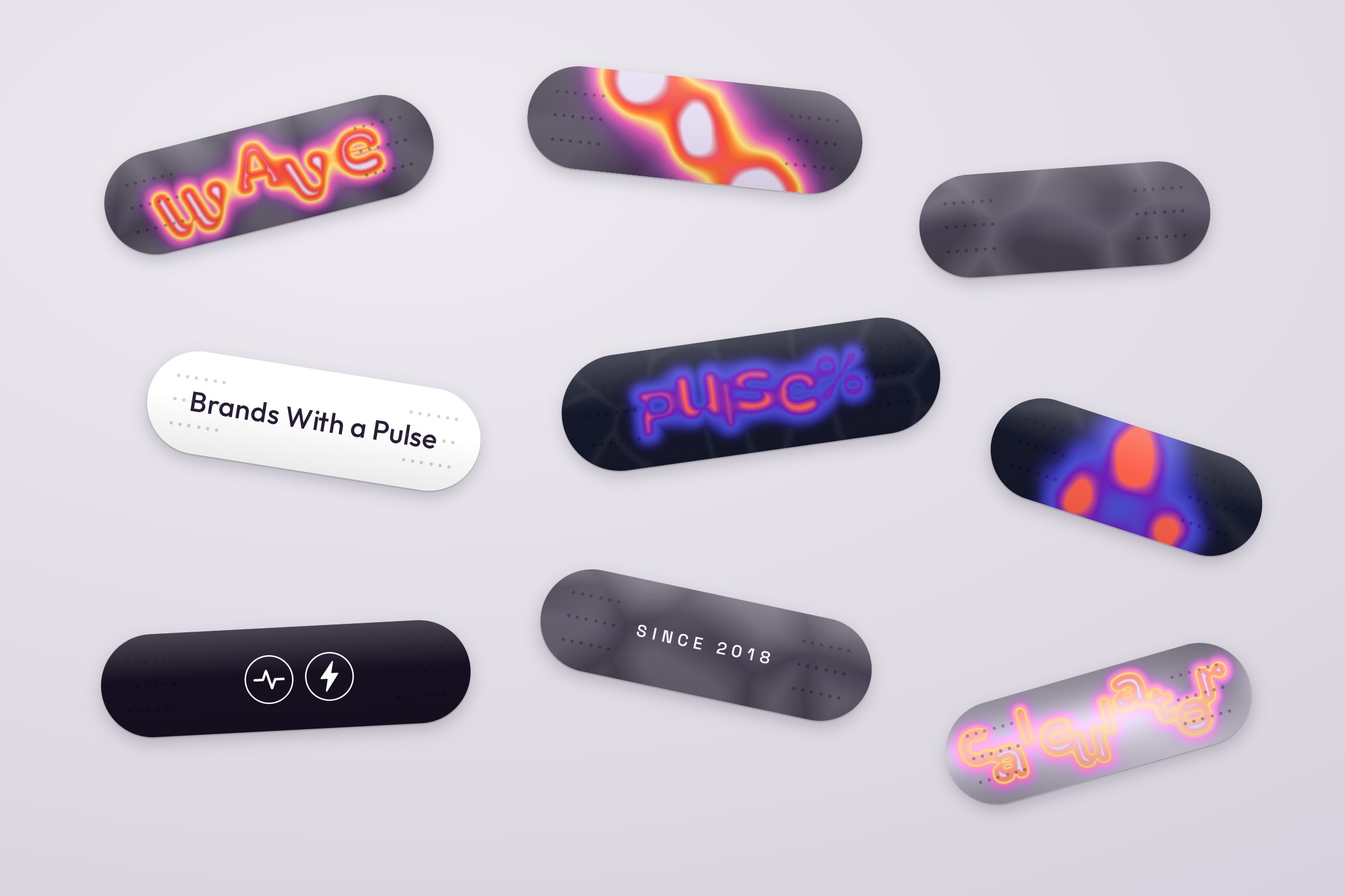
More dynamic identities in our work
- Driven Center — a modular identity assembled from ready parts, like building blocks, that recomposes for each carrier.
- Polyana IT — a circle for soft skills and a square for hard skills, constantly interacting in motion.
- Moon — crescent moons that multiply and scatter across carriers, forming a new composition each time.
- Typomania 2021 — letters that draw closer and move apart, and a logo that changes its form with the distance between them.
A tool for the brand's own materials
We have been making dynamic identities for many years. With technical progress, they now come with AI tools for our clients: inside them, the client's team designs brand materials in the visual system we developed, without bringing in contractors.
We put both halves of the system into tools like these. The variables can be changed: format, word, arrangement, palette. The constants are built in and can't be broken: the glow, the science layer, the typefaces. So any layout the team makes is still a recognizable point where the brand meets its customers.
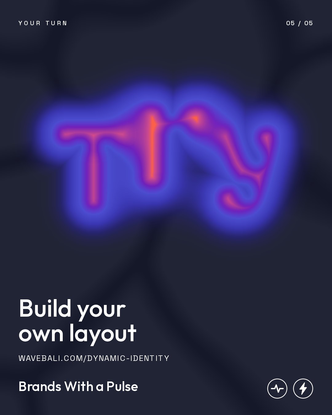
Below is one of these tools, made for Wave itself. Pick a format, type a word, arrange the living letters, add the slogan, icons and scale, and download the finished layout.
Drag the letters inside the format. Close together, they merge.1080 × 1350 px
aaInteractive tool for Wave's dynamic identity. The visitor picks a format (Instagram post 1080x1350, LinkedIn post 1200x627, YouTube thumbnail 1280x720, horizontal header such as LinkedIn cover 1584x396, X header 1500x500 or Facebook cover 1640x624, vertical Stories/Reels 1080x1920 or Pinterest pin 1000x1500, or a free size), types a word, drags the metaball letters inside the format, sets the letter size, chooses the Main, Light or Dark palette and the cell background, toggles the caption, slogan, icons, ultrasound scale and notes, and downloads a PNG in the exact size of the format.
FAQ
What is a dynamic identity?+
A dynamic identity is a visual system described by rules rather than by a ready set of layouts. A few elements stay constant, and they make the brand recognizable. The rest (for example arrangement, color, form, motion and behavior) changes from one carrier to the next.
How does a dynamic identity stay recognizable?+
Through its constants. In Wave's identity there are four: the glow and fusion of living forms, the science layer on top, the typefaces, and a typographic technique based on one of them. Whatever the letter arrangement or palette, the constants keep the brand recognizable.
How is it different from a static identity?+
A static identity is a logo, colors and a set of layouts that every new item repeats. A dynamic one gives rules, so you can make as many new compositions as you like and each still belongs to the brand. That matters for brands that need a lot of content for screens: social media, sites, presentations, motion.
Can a team make brand materials without a designer?+
Yes, if the identity comes with tools for the in-house team. For our clients we build AI tools where the variables can be changed and the constants are built in, so the team makes its own layouts and every one of them stays on brand. An example of such a tool for Wave is on this page.
How much does a dynamic identity cost at Wave?+
Every identity we make is dynamic, so its price is the price of a regular identity. We calculate it based on the business stage and the set of carriers.
You can get a preliminary estimate for your project here